Notifications settings pt I
Account email preferences
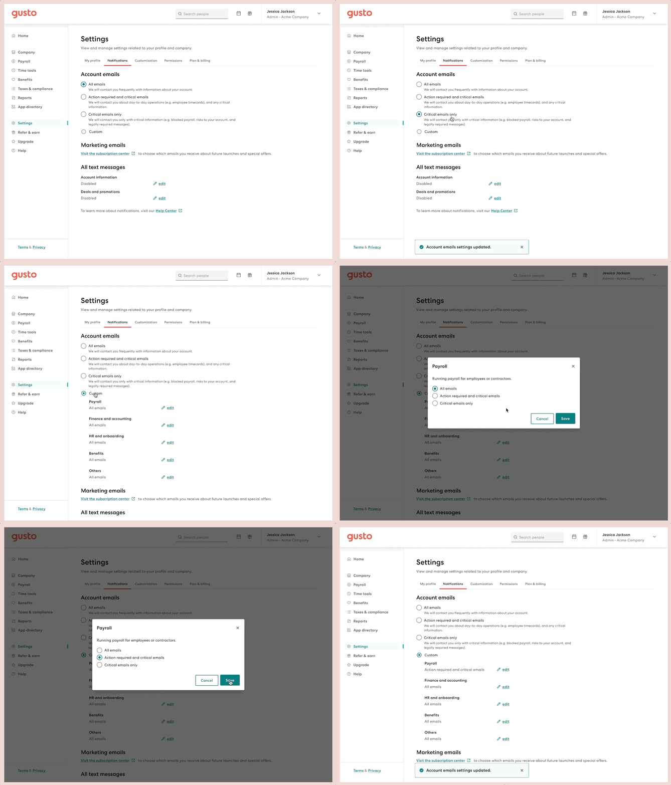
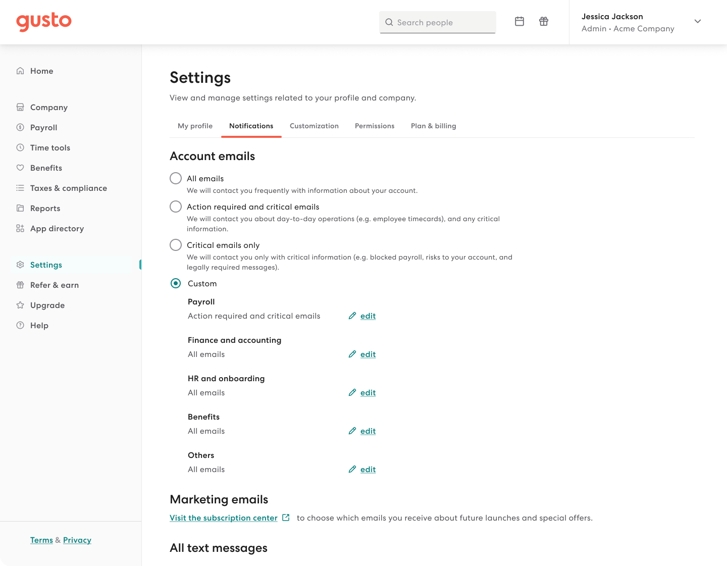
A feature allowing users to set their email preferences so they have control over account emails they receive.
✤
2022 ✶ Gusto ✶ Lead designer ✶ Web
Role
Design lead
Other contributors
Content designer
Design timeline
Jul - Sep 2022 (3 mos)
Platform
Desktop and mobile web
Role
Design lead
Other contributors
Content designer
UX timeline
Jul - Sep 2022 (3 mos)
Platform
Desktop and mobile web
Problem
User frustration with excessive emails is a known pain point in Gusto with 350 emails a year being sent to admins. A research experiment revealed that significantly reducing the volume of emails did not alleviate user frustration and that the real problem was not having control over the kinds of communications that actually matter to the user. It's not simply the volume, but the quality and relevance of the email itself.
Customer
Admins receive too many emails from Gusto which undermines what’s important.
Gusto
Serious consequences and support debt due to customers missing critical emails.
Proposal
A notification settings page to allow users to set their email preferences that adhere to legal and security requirements.
Understand
Discovery
The Accountants team recently launched their email preferences allowing users to choose all or only critical emails. The UXR study they conducted with accountants revealed that users generally categorize emails by critical, actionable, and informational. This was a good starting point to evaluate if their approach aligns with admins' needs as well.
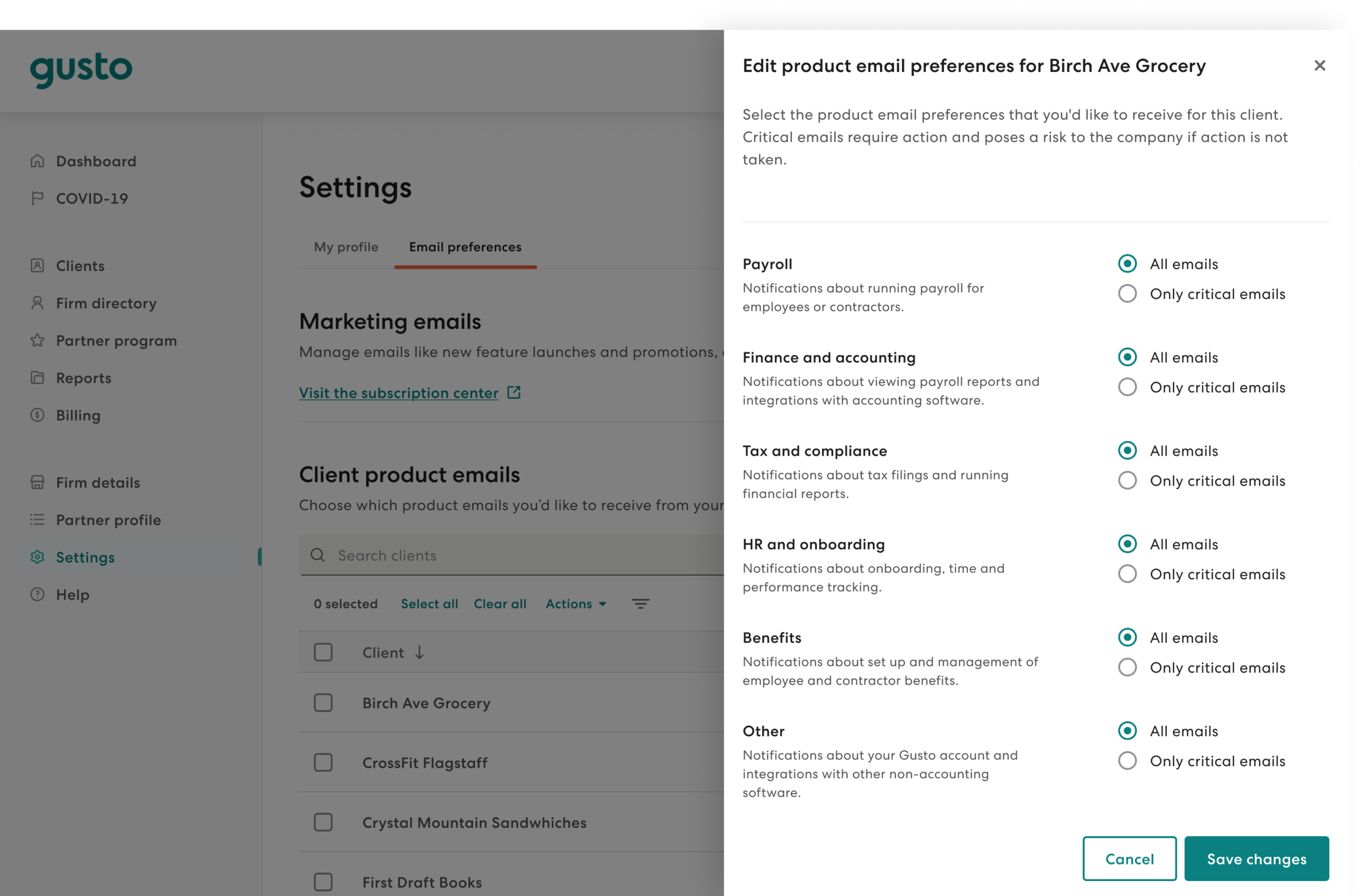
Gusto Pro Accountant's email preferences
Don't reinvent the wheel
Early on, I noted some design principles to help guide our solution, like making sure the options are clear so that users understand the outcome of their choice, but the biggest point is to not reinvent the wheel. After all, notifications settings is already an established pattern and there are certain expectations on how they usually work.
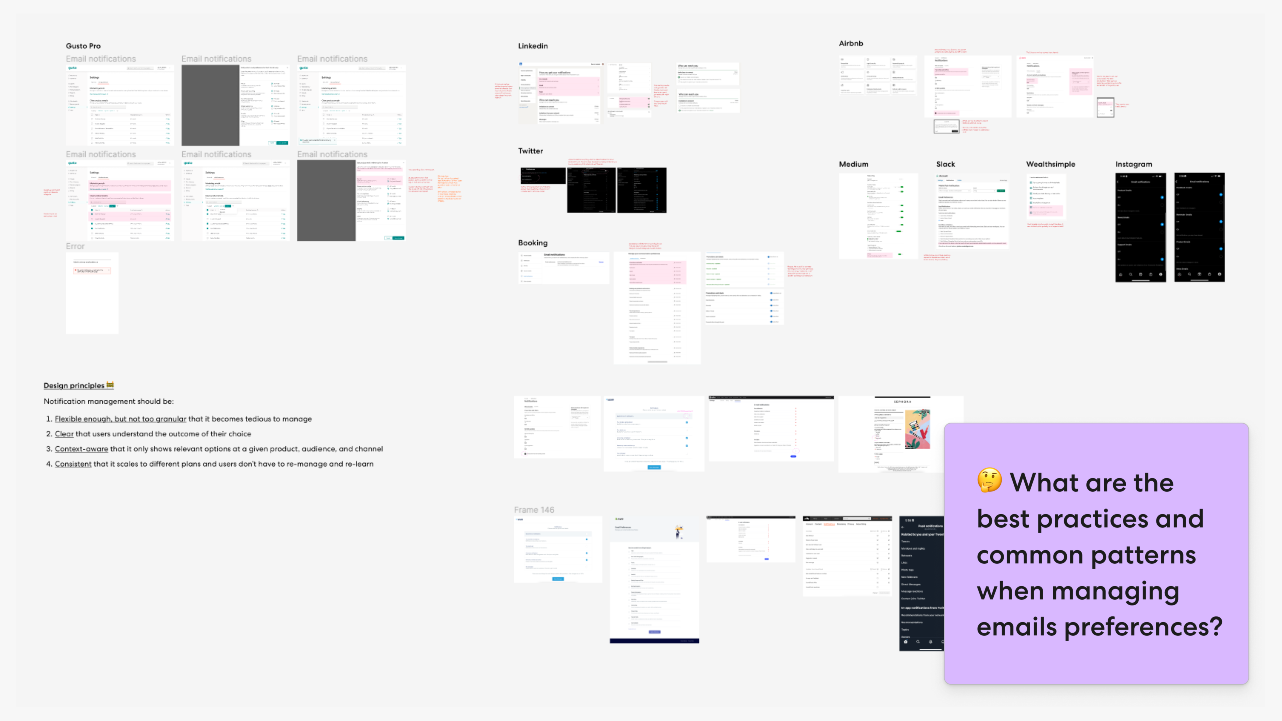
After speaking to the Accountant's team to understand their product decisions and limitations, I also researched email settings out in the wild, from the most simple to the most complex experiences to learn different ways they organize information and common patterns.
I then listed down common categories with examples for each. At a high level, apps seem to have industry-specific categories with channel and frequency being similar. For example, LinkedIn has jobs, hiring, and networking while Airbnb has travel regulations, travel tips and offers, and trip planning. Feeling inspired, I began writing down how this IA translates to Gusto:
Categories
• Promotions and deals, Product and services, Loyalty Programme
• Tips, Announcement, Account updates
• Conversations, Jobs, Network, Enterprise products
Channel
• In-app or push, Email, SMS
• From Twitter, From followers, From people you follow
Frequency
• Daily, Weekly, Monthly
Ideate
Product and design brainstorming
I collaborated with our PM on a matrix exercise for in-app notifications, plotting all notifications based on urgency and importance. Recognizing a connection with the accountant's solution, I presented initial ideas in a work-in-progress review for feedback from XFN partners.
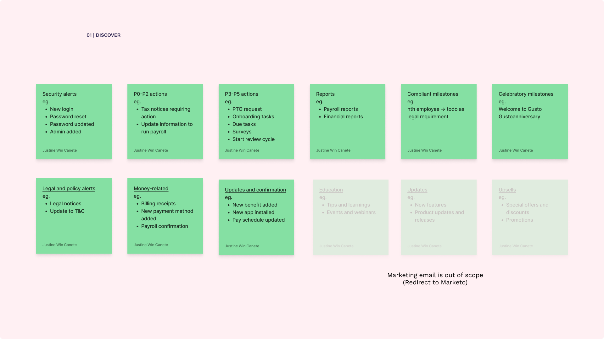
Industry and Gusto-specific comms categories
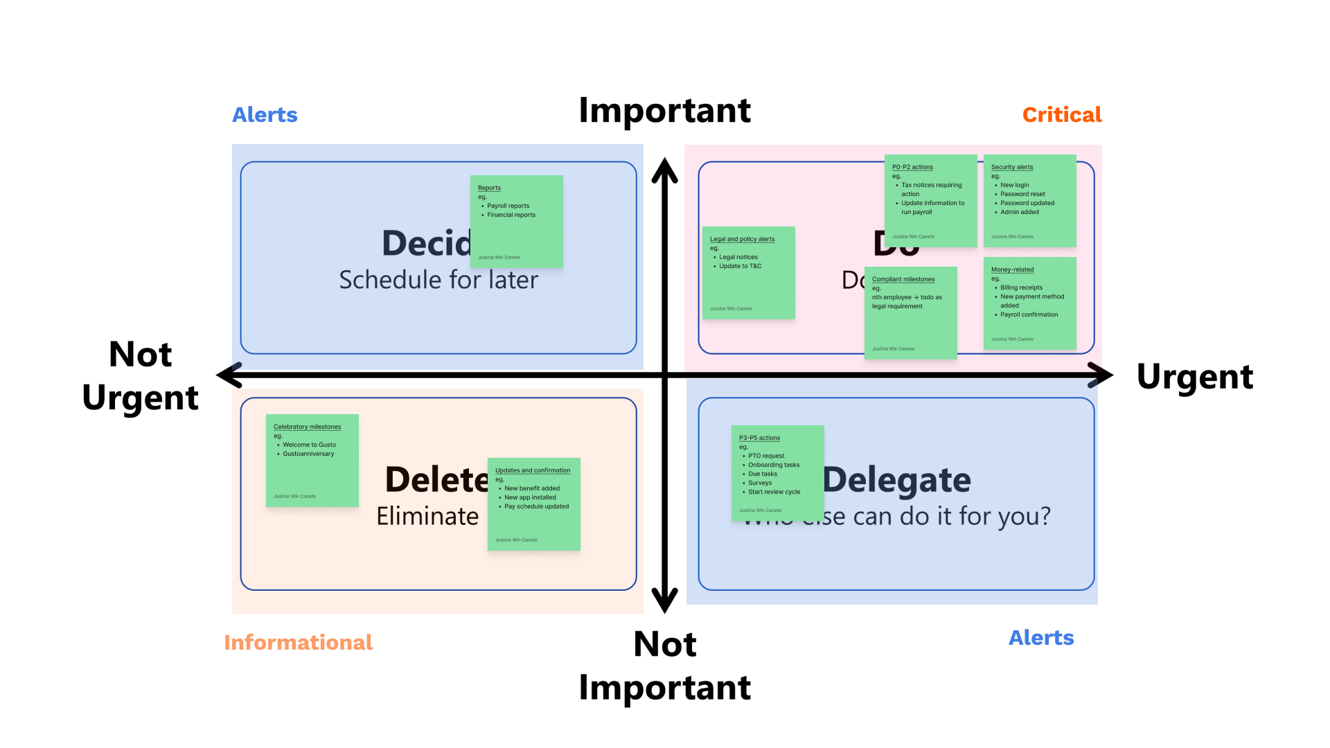
Important vs Urgent matrix
Ideate, review, iterate
First pass
The initial attempt was subpar, resembling an unclear, tedious, and inaccessible experience. Despite aligning with the accountants' work, the review prompted a pivot. Intuition guided me towards the promising approach of implementing tiers or buckets, ensuring users receive critical emails at a minimum.
I continued looking at examples of how apps make critical emails mandatory, some apps imply it in their Unsubscribe All, while some make it explicit without the ability to turn it off. It's just a matter of choosing the right pattern that makes sense for Gusto.
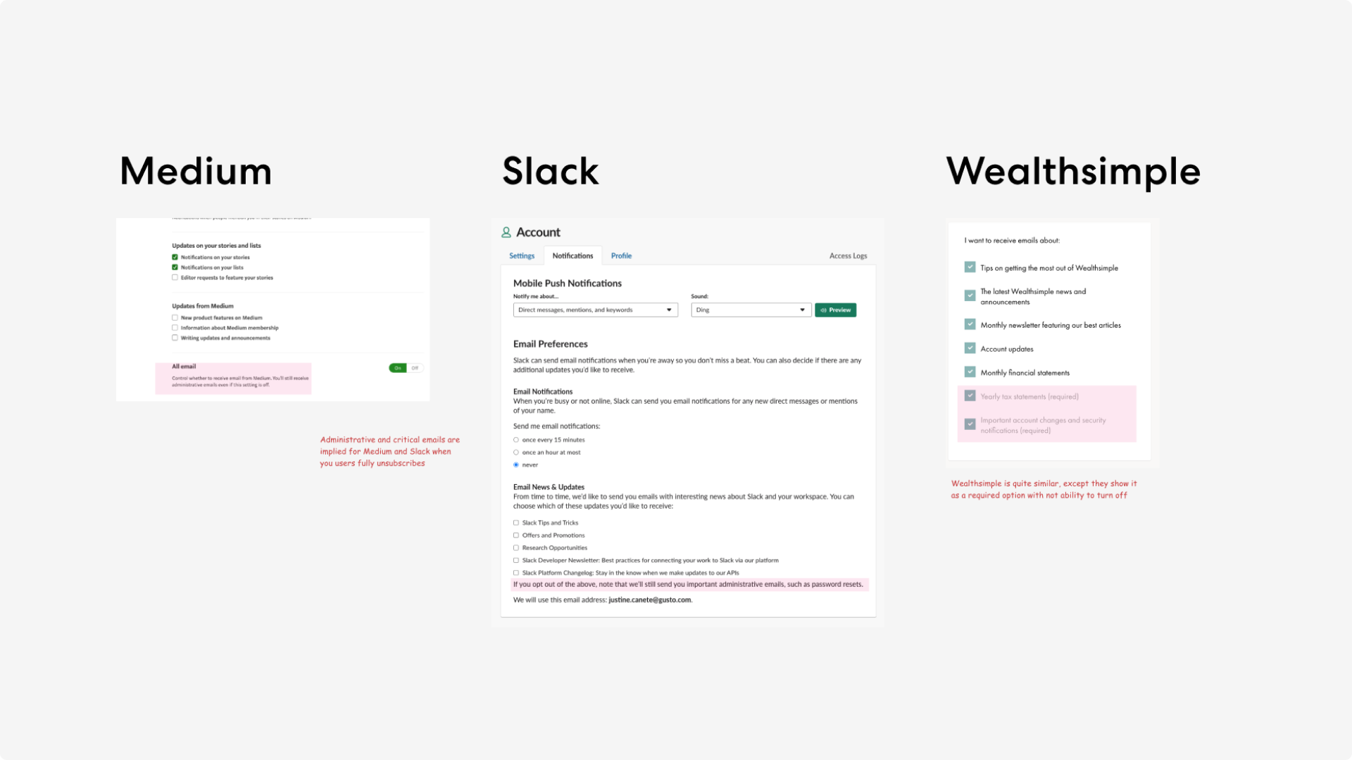
Medium, Slack, and Wealthsimple notifications settings
Along the way, compromises needed to be made and requirements needed to be defined: As much as possible, I kept them generic enough not to be too prescriptive on the final solution:
✤ Requirements
- Users should receive critical emails. These are things they can’t opt out of like emails related to security, pricing changes, and payroll confirmations.
- Users may also want to receive actionable, informational, or both.
- Users should only receive emails they have access to based on their permissions.
Compelling idea
Tier concept
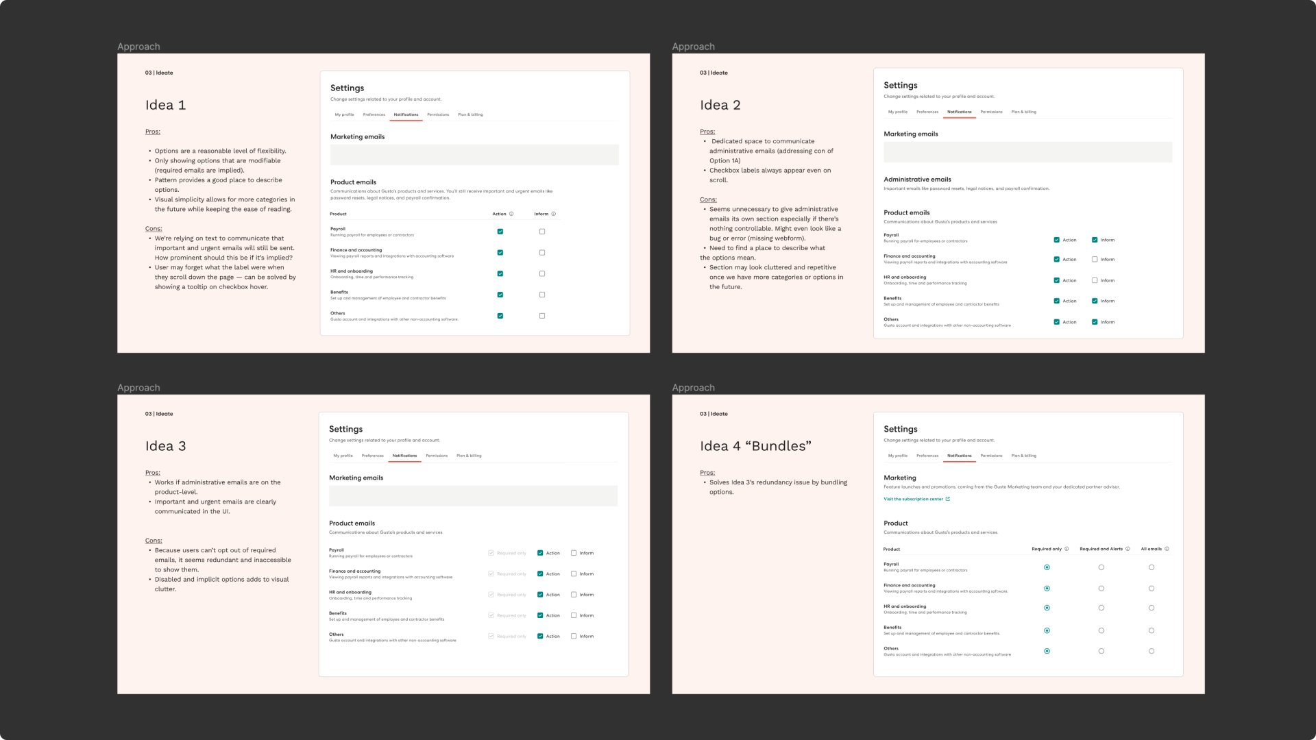
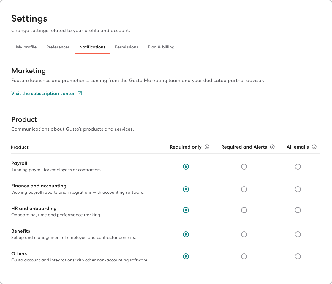
The tier concept was the most compelling idea, so I continued exploring what “adjusting the volume” may look like. The options were the biggest piece of the puzzle. Ultimately, I landed on 2 strongest ideas, where we can either go the volume-based or type-based approach.
Final solution
Navigation
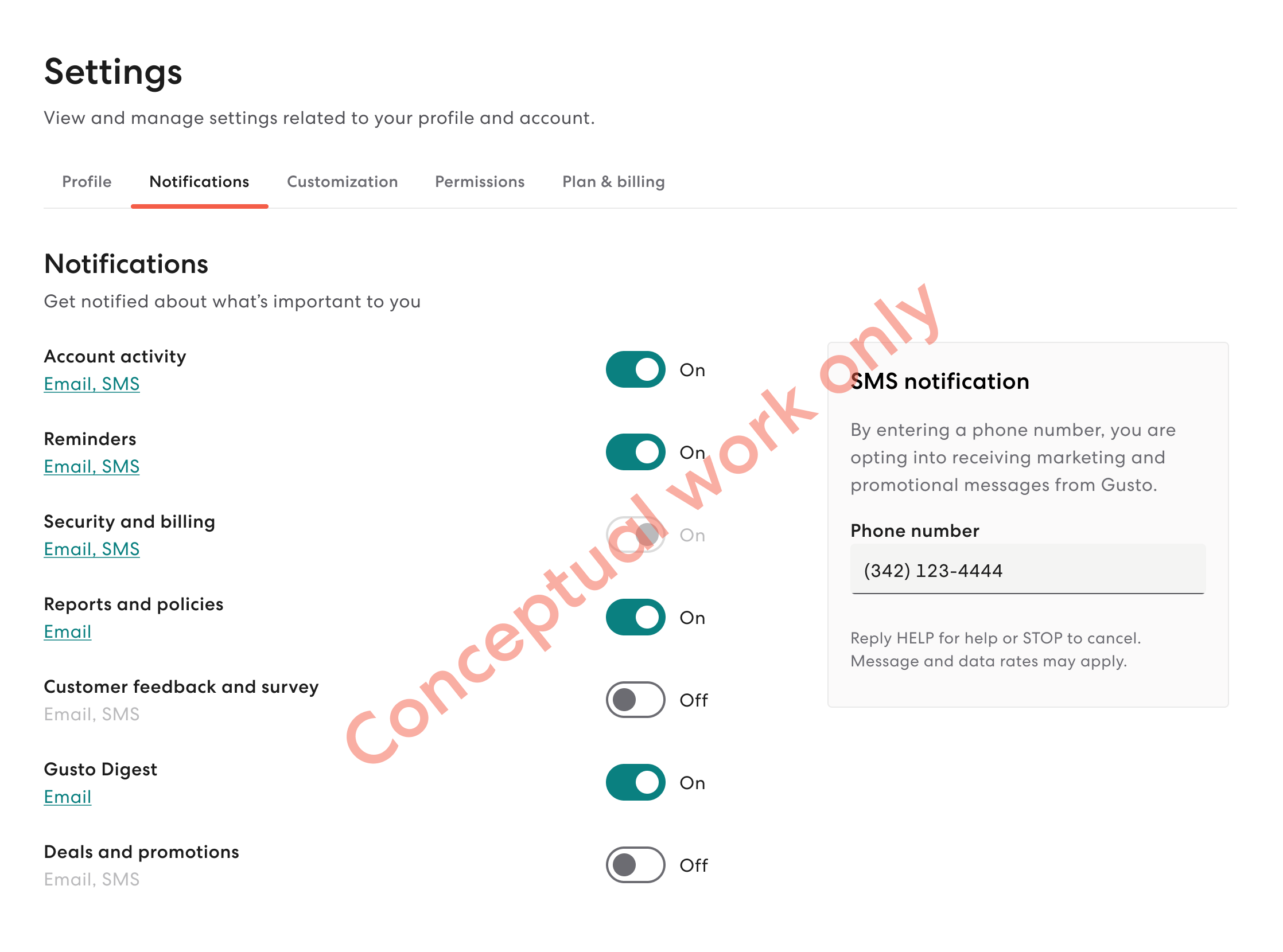
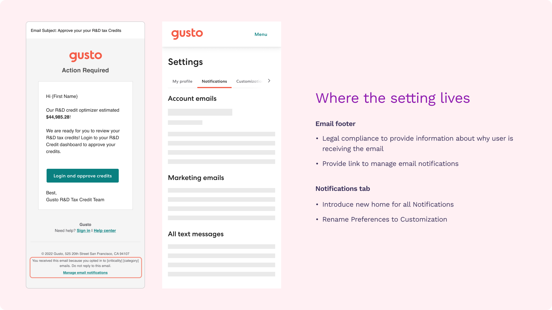
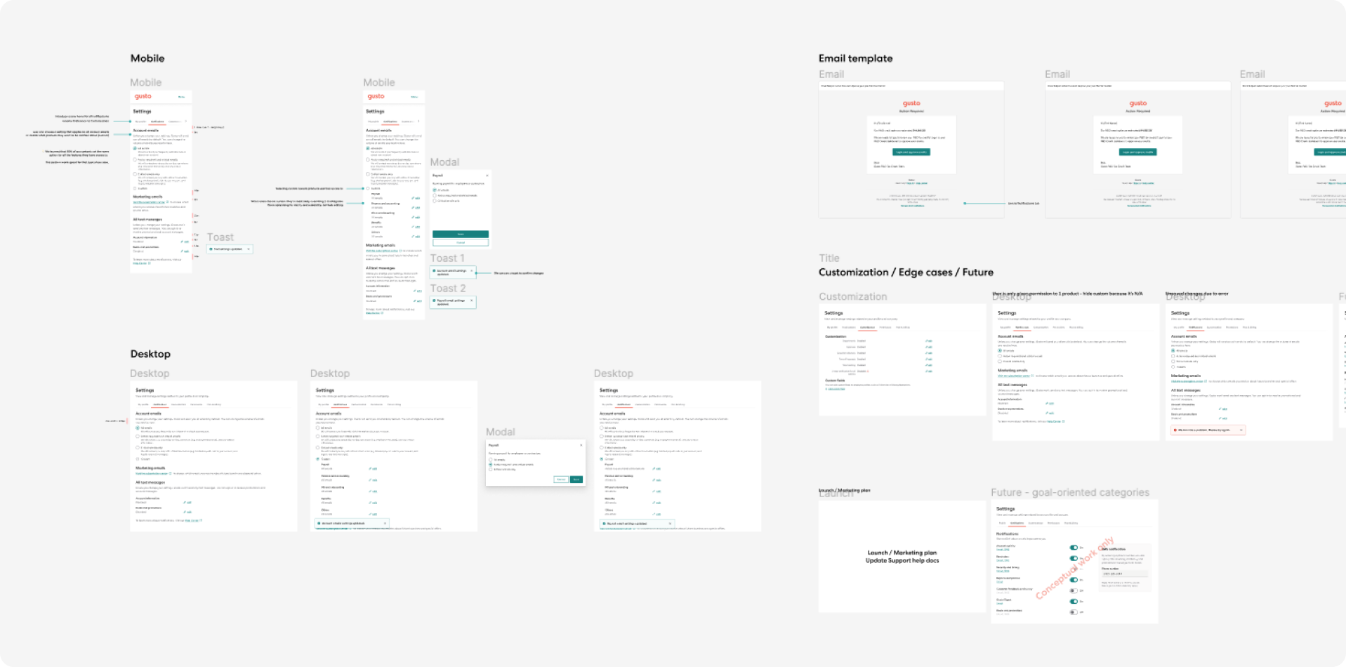
I explored the Settings page to identify a suitable location. Noticing a potential confusion with the existing Preference tab, I proposed renaming it to Customization and introducing a new tab called Notifications. The change was seamless, and we relocated text messages and marketing emails. To address accessibility and discoverability, I reflected user preferences in the email footer with a link to the Settings page.
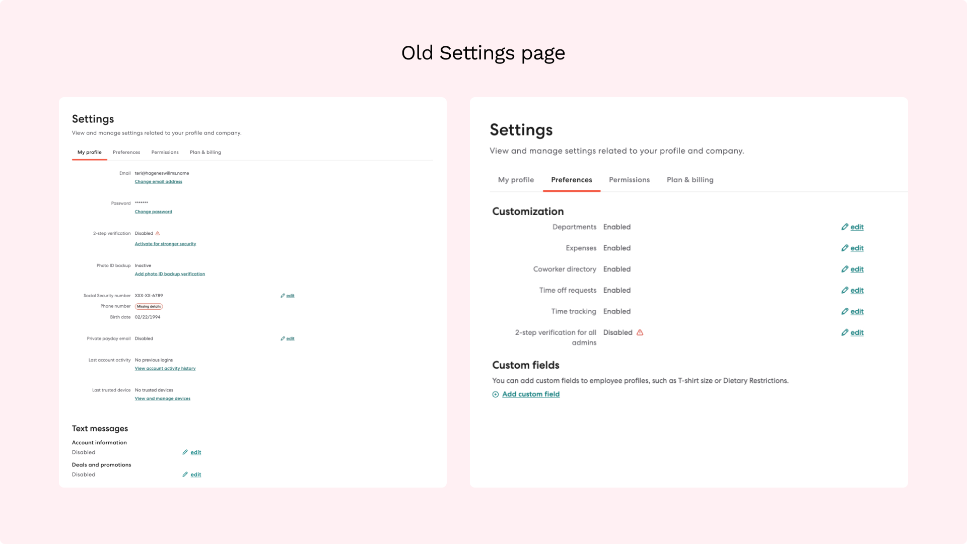
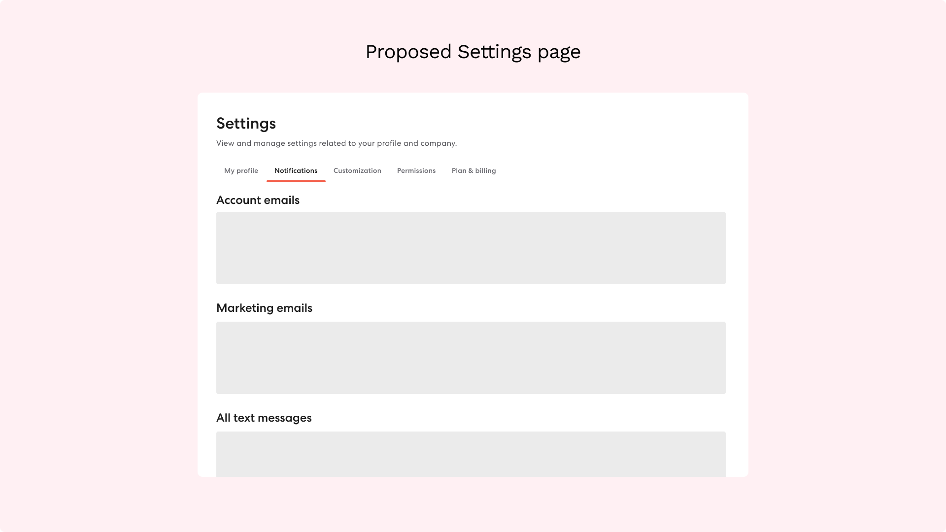
Before and After Navigation
Options and Grouping
Following UX critiques and hallway testing with 10 Gusties, it became evident that grouping by email type with real examples for each bucket was the clearest approach. This aligns closely with goal-oriented categories, emphasizing users' interest in the types of emails rather than sheer volume. The question arose: what's the value in receiving few emails if they miss what they personally deem important?

Content
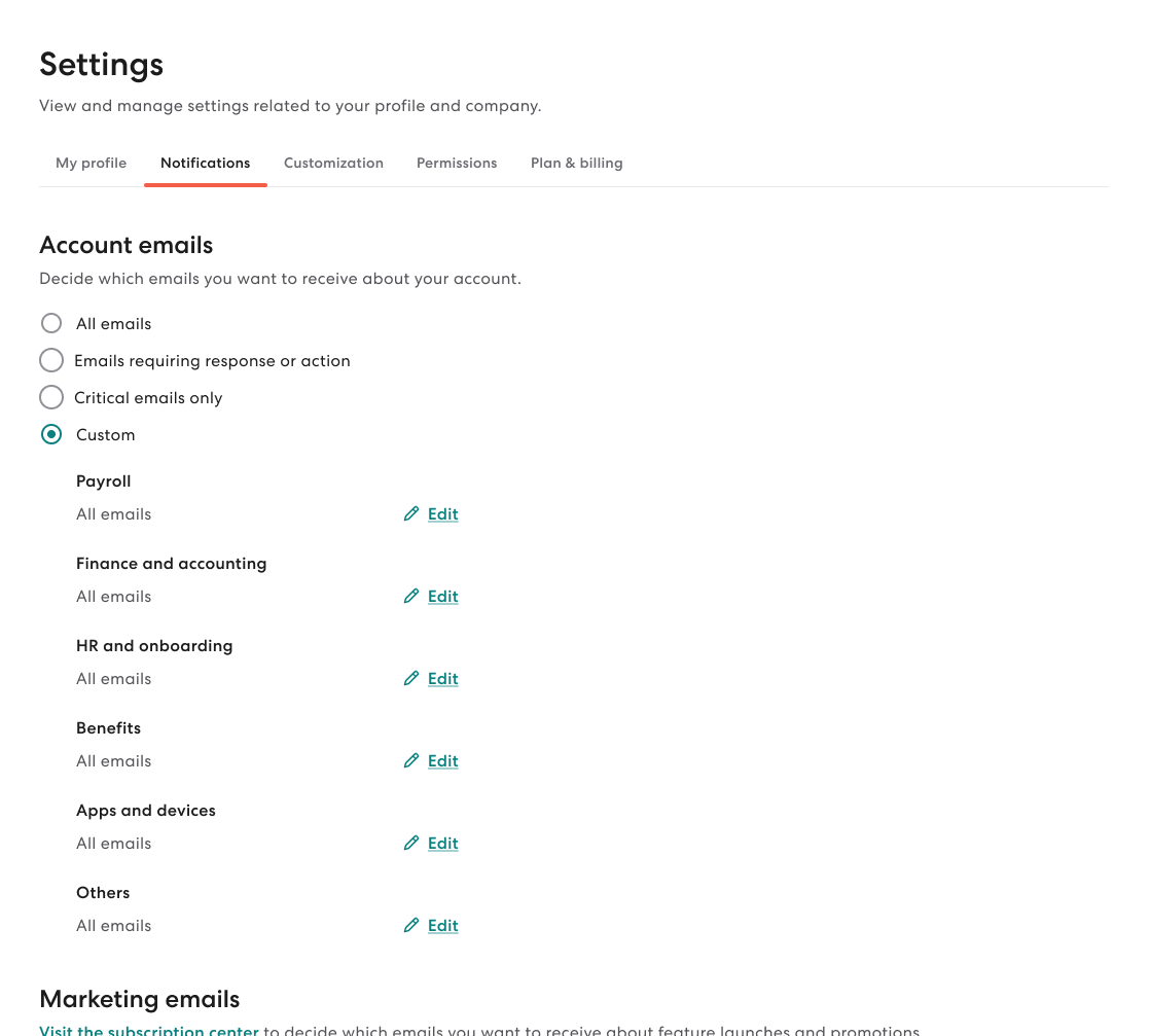
I had a decision to make: Should we display all permission categories with options for each or allow an aggregated option with customization ability? The former mirrors the Accountant's team's approach.
My assumption is that admins care more about the types of emails across all categories tied to their role, rather than specific categories. Leveraging data from the accountants' implementation, where 80% set the same option for all categories, informed my solution. Admins, much like accountants, are likely to prefer a streamlined setting for their role, minimizing decision-making, while still allowing customization for specific needs. During this phase, I onboarded our new content designer, providing insights into my content decisions and establishing context for her upcoming work on our email writing guidelines.
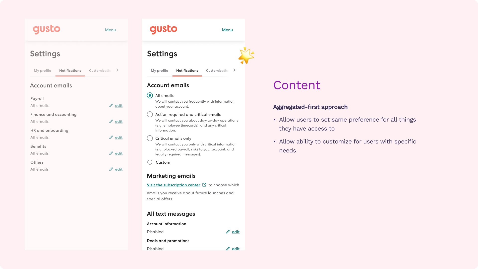
Admins, much like accountants, are likely to prefer a streamlined setting for their role, minimizing decision-making, while still allowing customization for specific needs.
Default settings
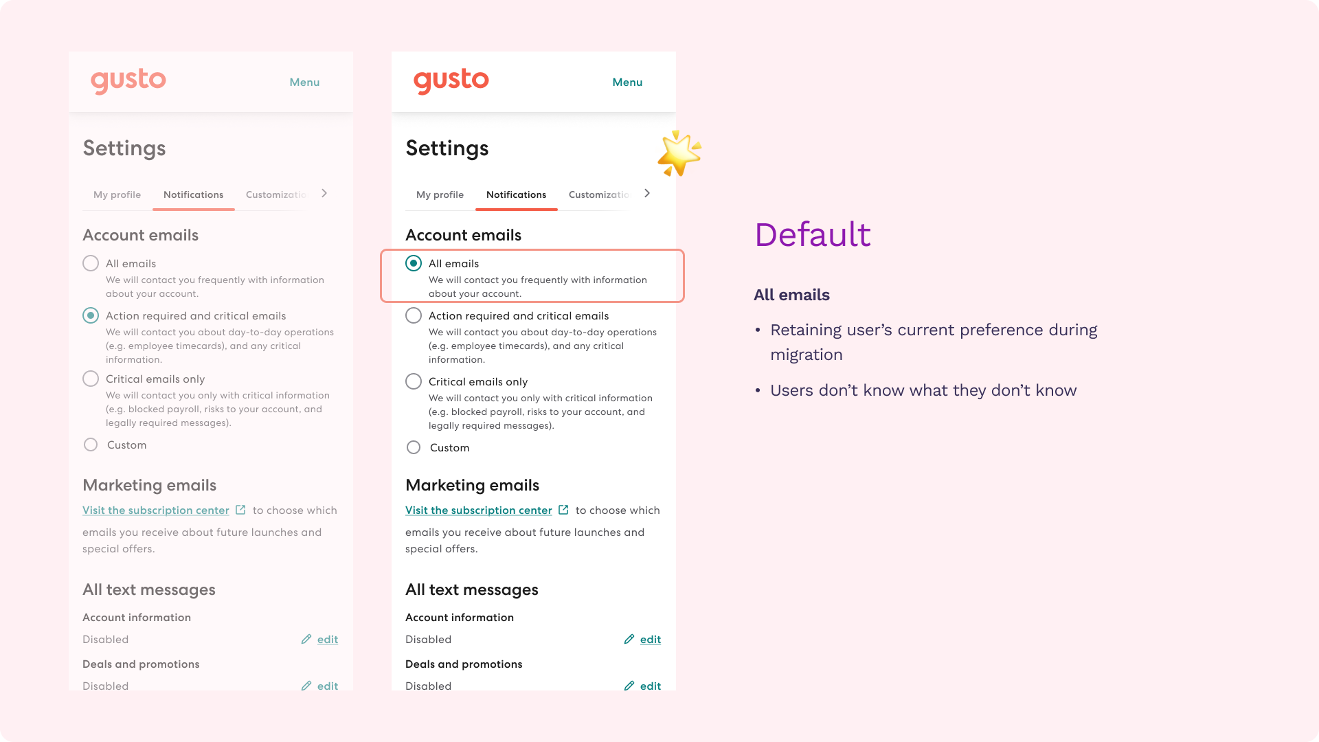
Now, a crucial question arises about the default option. Initially, I leaned towards the second option, the "goldilocks/just right" choice, assuming most users would prefer it. However, insights from our UX researcher highlighted a key point—users are often unaware of what they don't know, a recurring theme in feature awareness UXR studies.
Considering users previously received all emails, abruptly opting them out of informational emails doesn't feel right. There's more risk in them missing potentially important emails, as opposed to having the option to opt-out if they choose.
Ship and support
Dev handoff
The UX work concluded with a dev handoff, and ongoing support involved providing feedback to our developers during the build and addressing any emerging edge cases. Additionally, I conducted a walkthrough on accessibility testing during the testing phase, contributing to upskilling our team.
✶ Impact
- Out of all admins who set their email preferences, 91% of them set it once. 98.4% chose from the aggregated options.
- Out of all accountants who set their email preferences, 83% of them set it once. 87% chose from the aggregated options.
Last updated Nov 2023
✤ Learnings
- Settings is a set-and-forget experience. It should empower users to make less and decisive preferences.
- Leverage and take inspiration from existing solutions for common problems, then figure out where context-specificity lies.
Thinking ahead
Future of notification preferences
Thinking long-term, I believe that the future of notifications preferences is goal-oriented rather than volume-oriented. If our team vision is to communicate the right message to the right user at the right time through the right channel at scale, it makes sense that the person starts with "What kind of messages do I care about?" followed by "How do I want to receive them?".
