Payment terms
A feature that allows merchants to set due dates on orders so they know when to collect payment.
✤
2021 ✶ Shopify ✶ Lead designer ✶ Web & mobile
Role
Product designer
Other contributors
Sr. product designer
Staff content designer
UX timeline
Aug 2020-Mar 2021
(8 mos)
Platform
Desktop web
Mobile native
Role
Product designer
Other contributors
Sr. product designer
Staff content designer
UX timeline
Aug 2020-Mar 2021
(8 mos)
Platform
Desktop web
Mobile native
Payment terms is a new feature that allows merchants to set due dates on orders so they know when to collect payment.
At the time when I first joined the draft orders team at Shopify, we had just rolled out an ability to collect deferred payments but lack an essential piece of deferred payment information — due dates. Because of this, merchants have to manually record when payment is due, usually on paper, or more commonly, use external systems like Quickbooks that support payment terms.
Shopify's goal is to be the source of truth for all payments.
Our goal
Merchant-level
Support payment terms so merchants can set due dates on orders and track payments efficiently all within Shopify.
Business-level
- Bring home hijacked GMV by offering a fundamental requirement for B2B and globalizing Shopify.
- Build the foundation for event-based payment terms (eg. due on delivery) so we can support our partner’s use cases.
Design principles
Clear and straightforward
Setting up payment terms should be intuitive and straightforward. We should only ask for user input that is relevant to each payment terms type.
Understandable
Payment terms is an industry terminology common in B2B but not in D2C. We should use inclusive language and find opportunities where we can educate merchants.
Because payment terms is more common in B2B (business-to-business) but not D2C (direct-to-consumer), and order creation can already be a tedious task, the UX solution has to be clear, straightforward, and understandable.
Our proposal is to first fix the buttons on draft orders as this was one of the biggest takeaways from previous research done by the team. This way, we’ll have a proper place to introduce payment terms. Merchants should also be able to track overdue payments so they can take the necessary action.
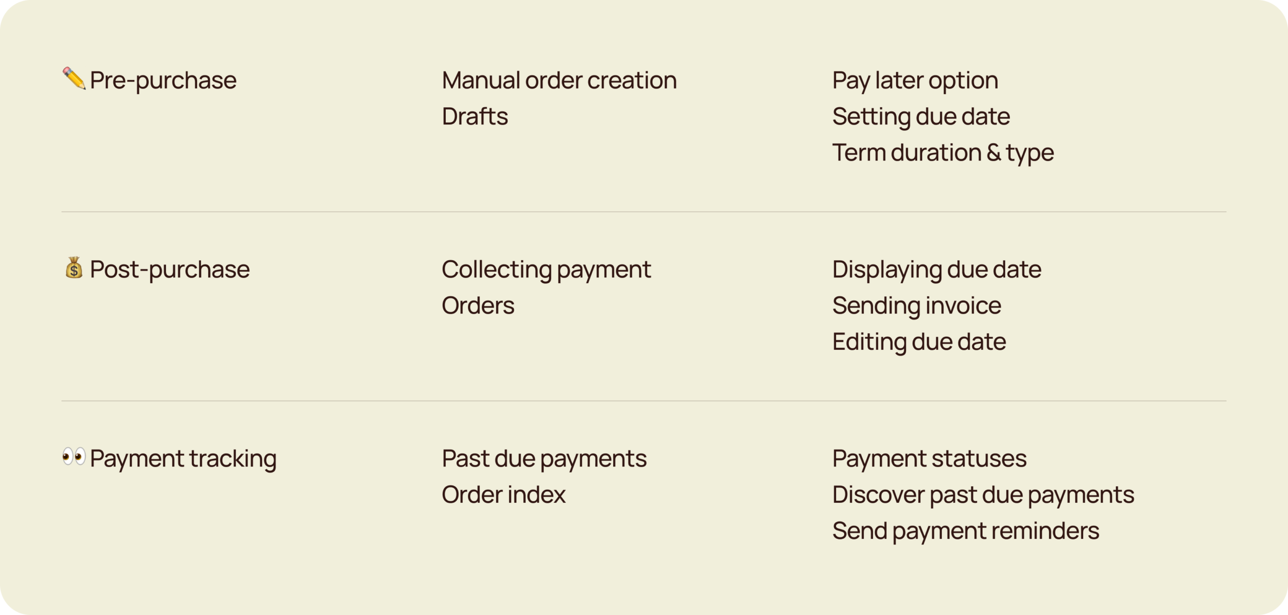
Understand
Key concepts of an order cycle
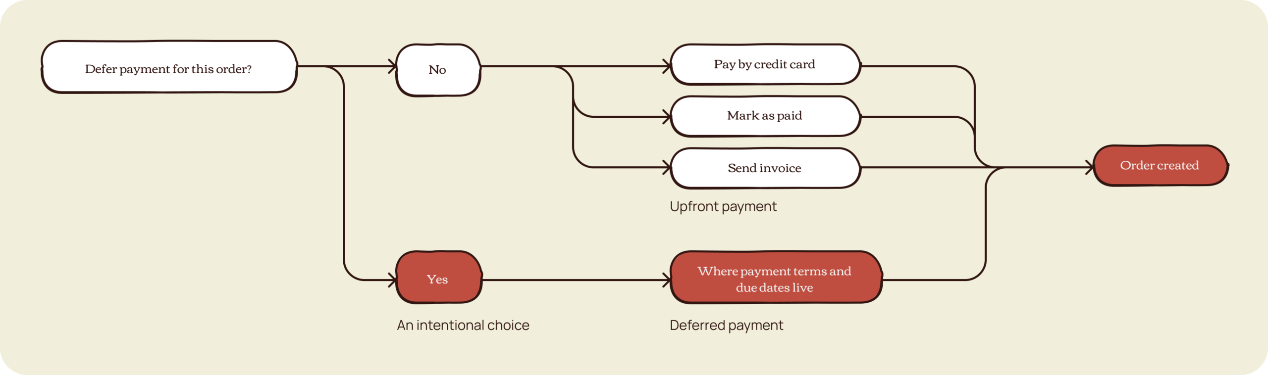
After countless explorations and pairing sessions, we landed on this decision tree where deferring payment is an intentional choice, that then provides a place to set payment terms.
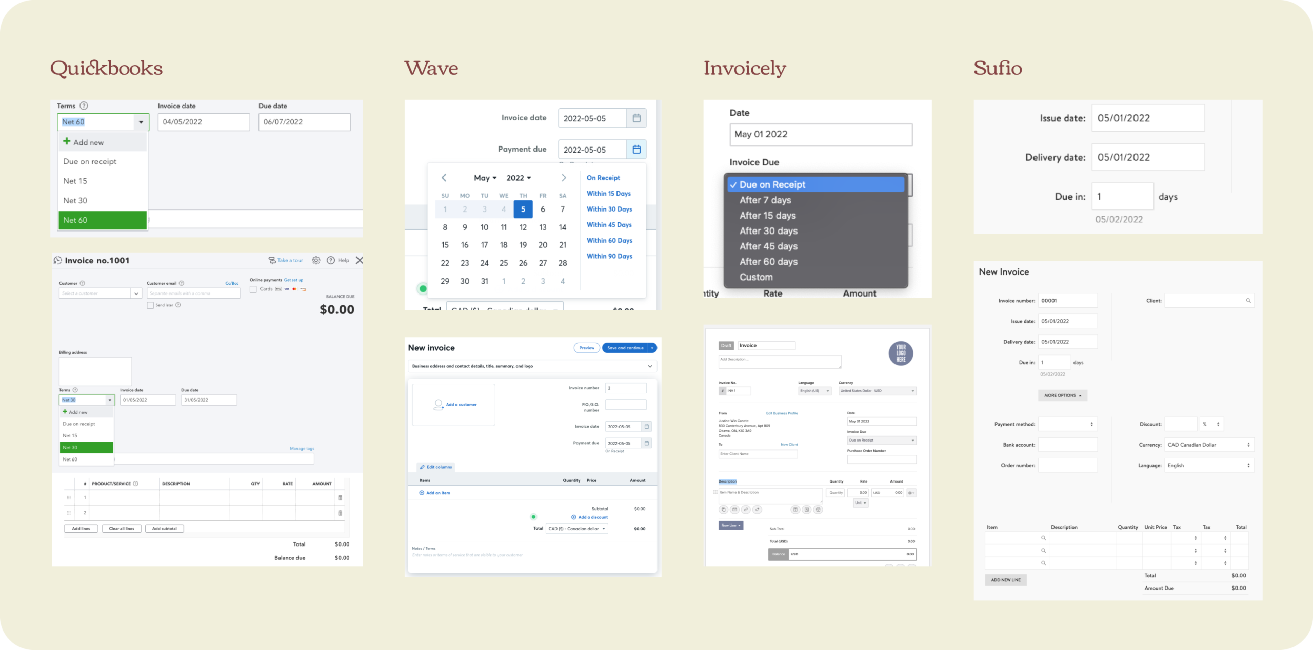
Next, I investigated widely-used invoicing apps and the ways they set up payment terms. I observed that they have similar ways to set it up, particularly the use of duration or x number of days and the invoice date to determine the due date. My assumption is that this is easily understood by both D2C and B2B merchants. Quickbooks however is primarily used by B2B, which probably explains why they’re using the industry term.
Ideate
Initial explorations
I continued exploring how the journey starts and what selecting payment terms might look like. I narrowed it down into two compelling ideas: payment terms as an action, or as a payment attribute.
Ideate
First iteration
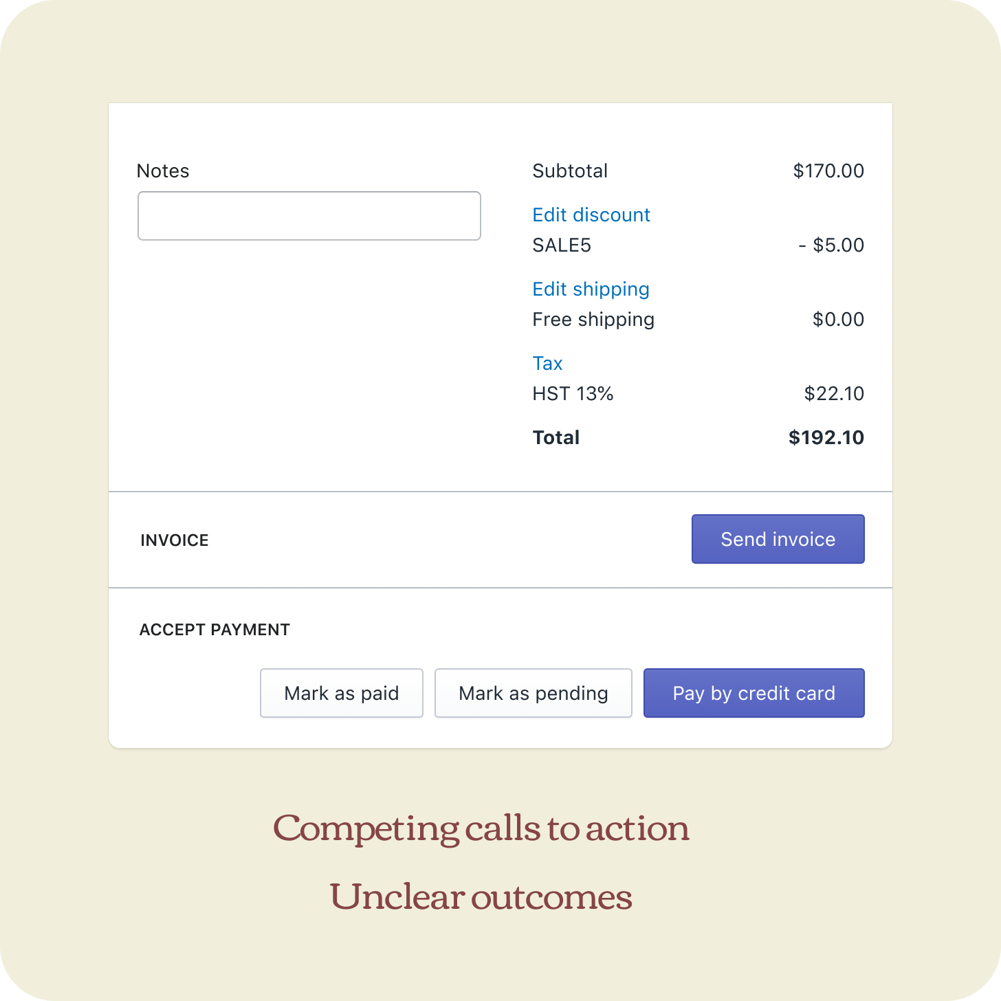
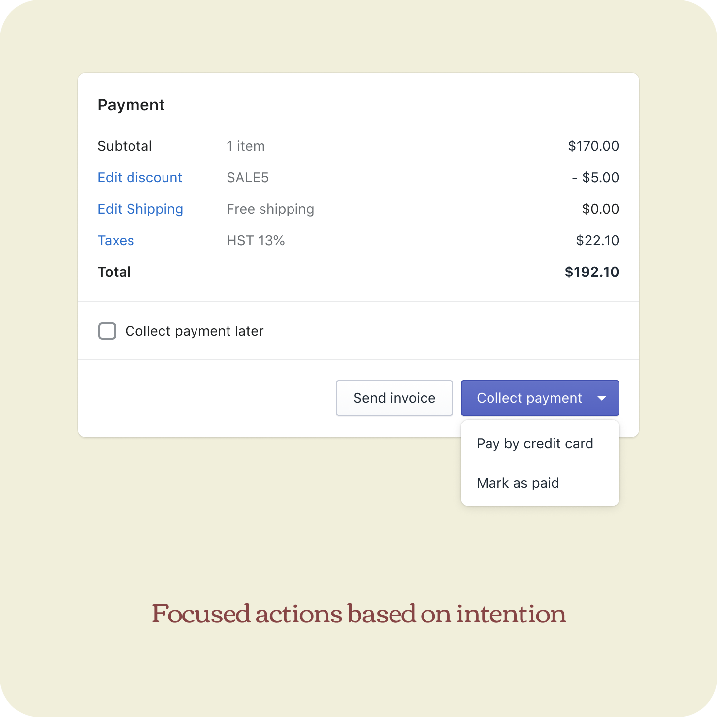
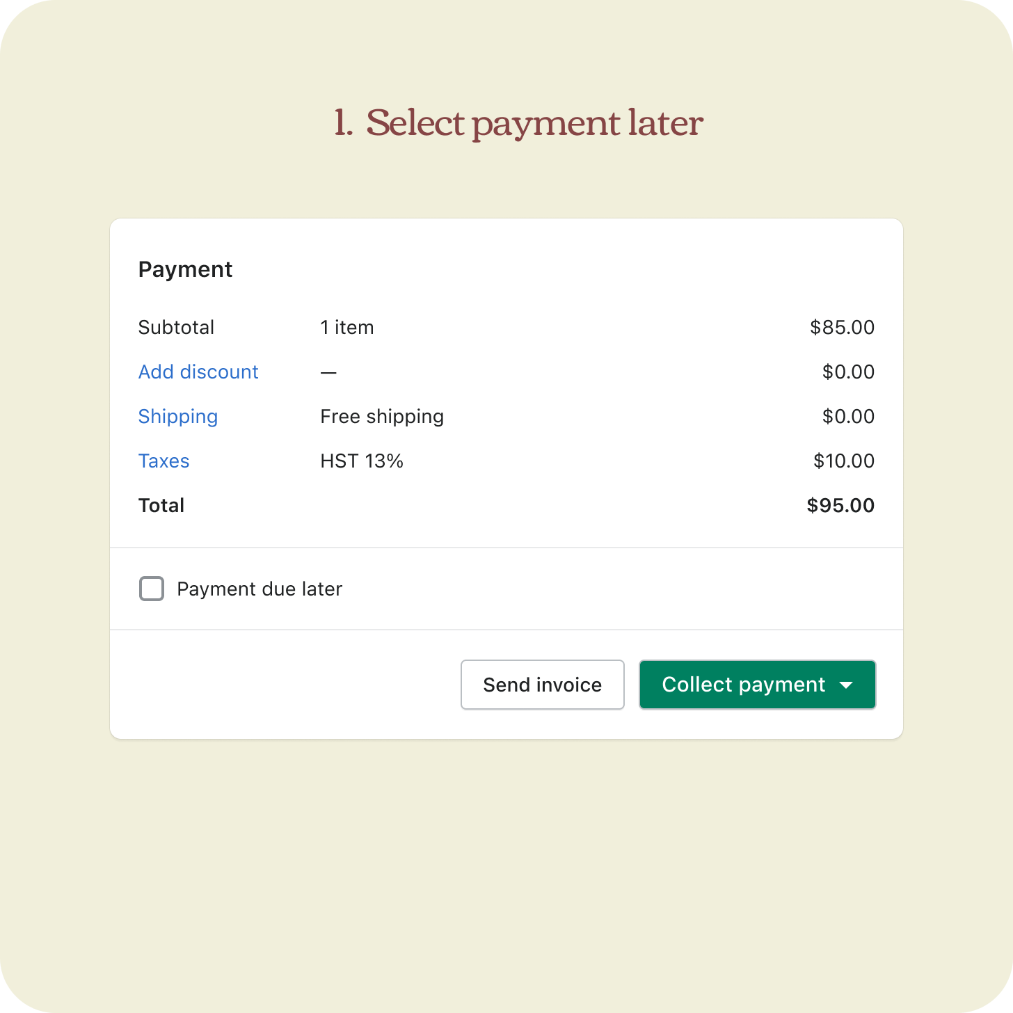
Fix the competing CTA
For the first iteration, our focus was to test the first two proposed solutions which were to fix the competing CTAs and introduce payment terms. We went from having all payment actions presented all at once to grouping and describing intentions better.
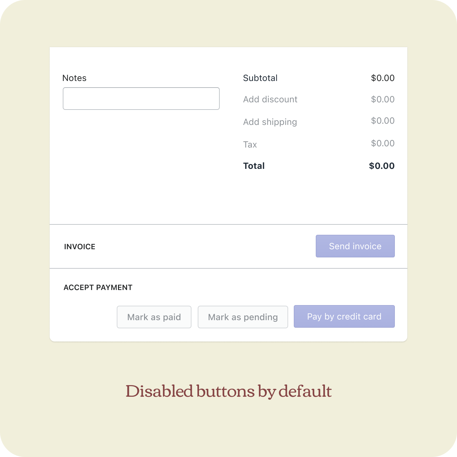
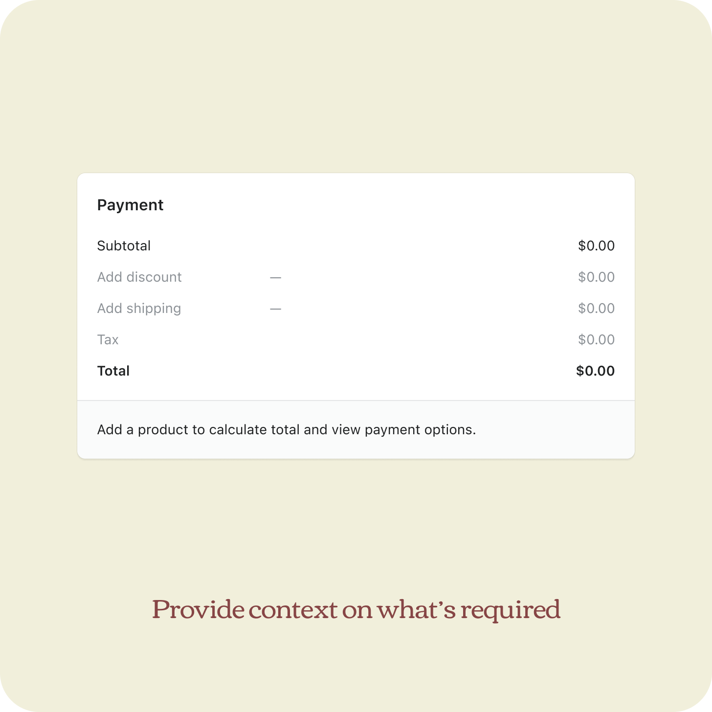
Fix accessibility issues of empty state
I also observed that the empty state of order creation displayed disabled buttons by default without guidance on what’s required to enable them. This experience is not accessible and confusing, especially to merchants who are new to this page. I proposed an improvement which was implemented and shipped right away. We continued using this pattern for payment terms.
Support key concepts of payment terms
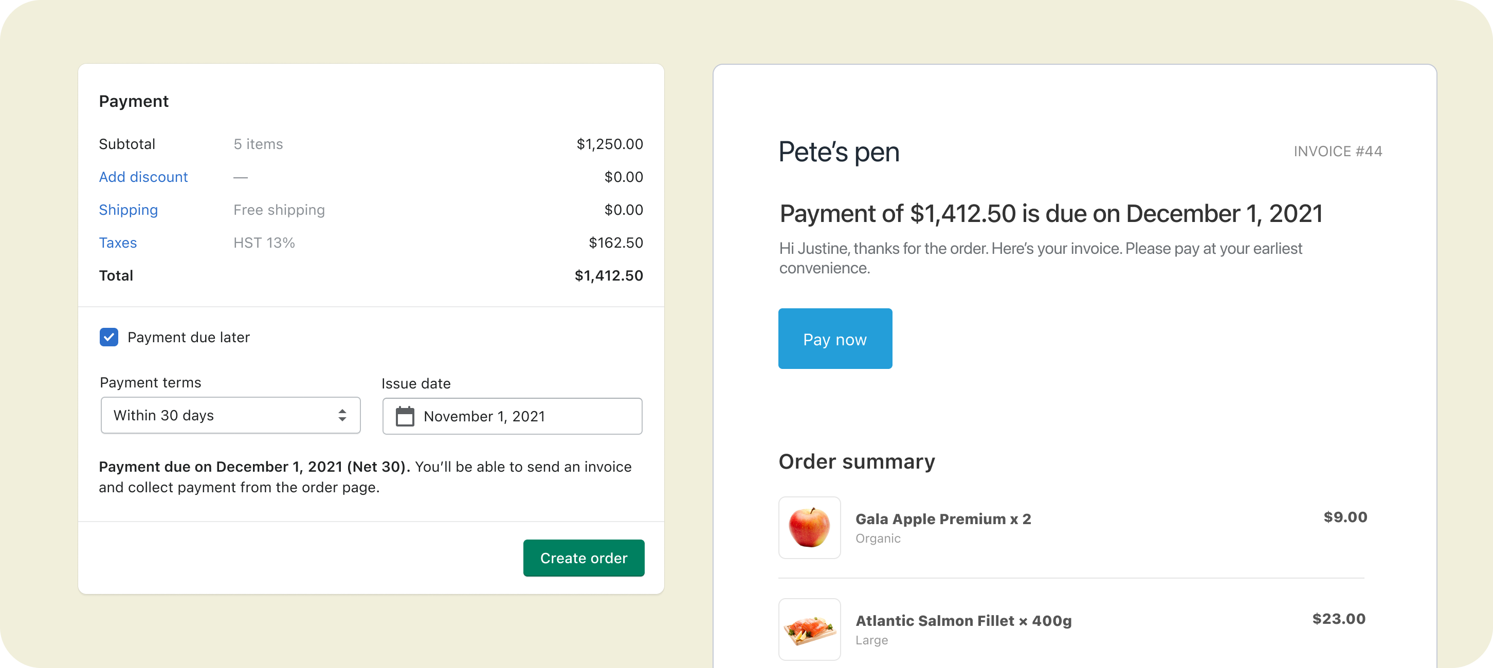
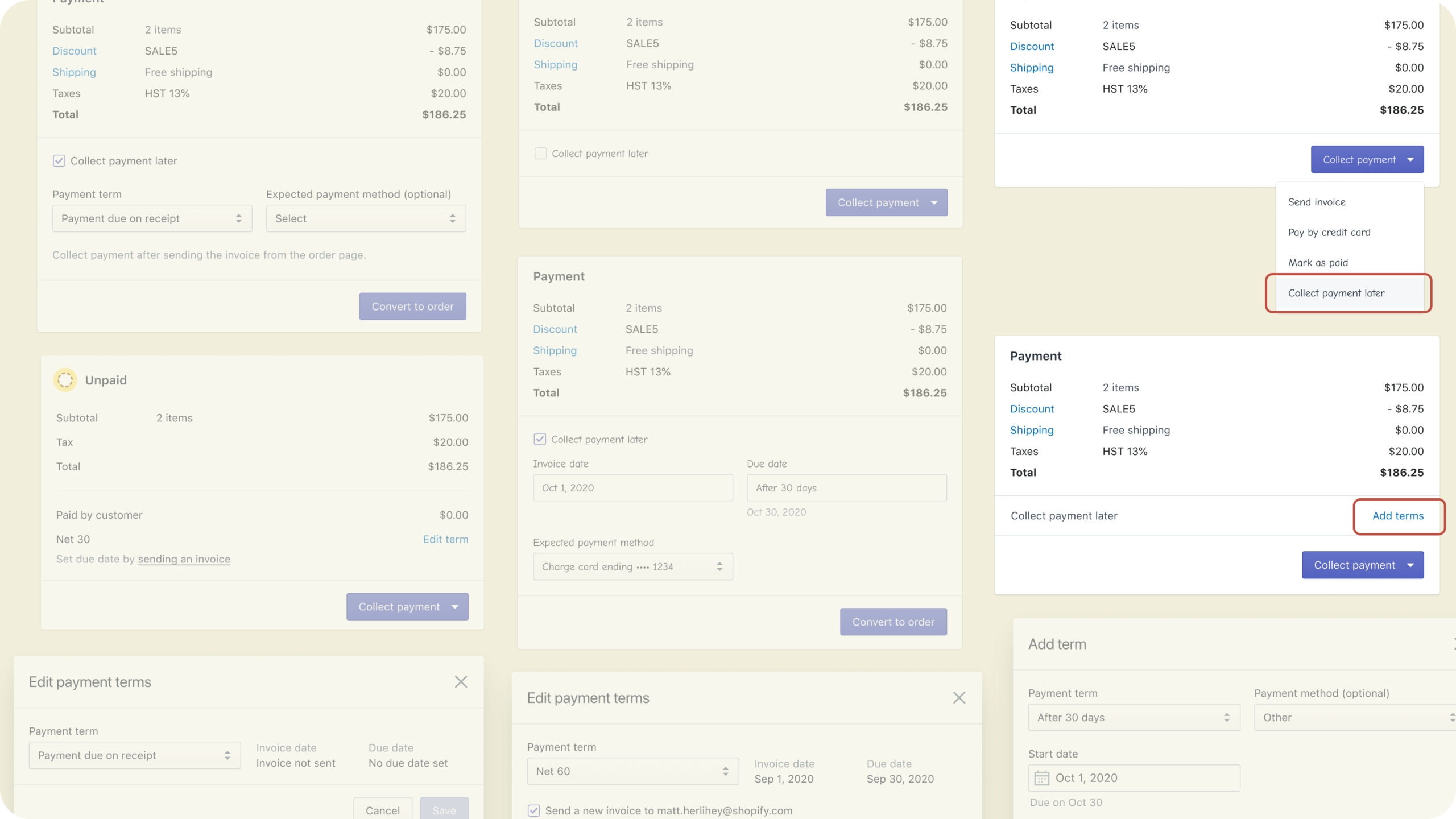
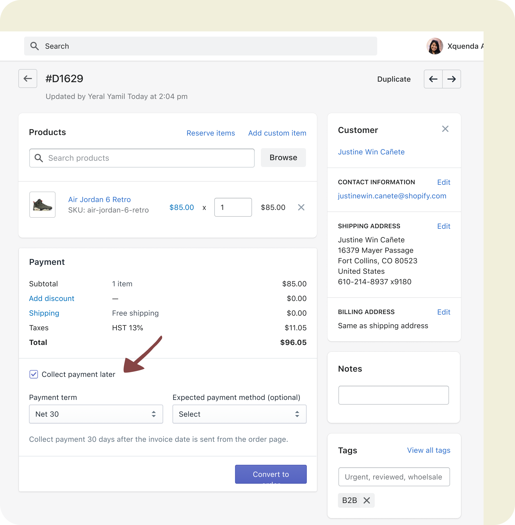
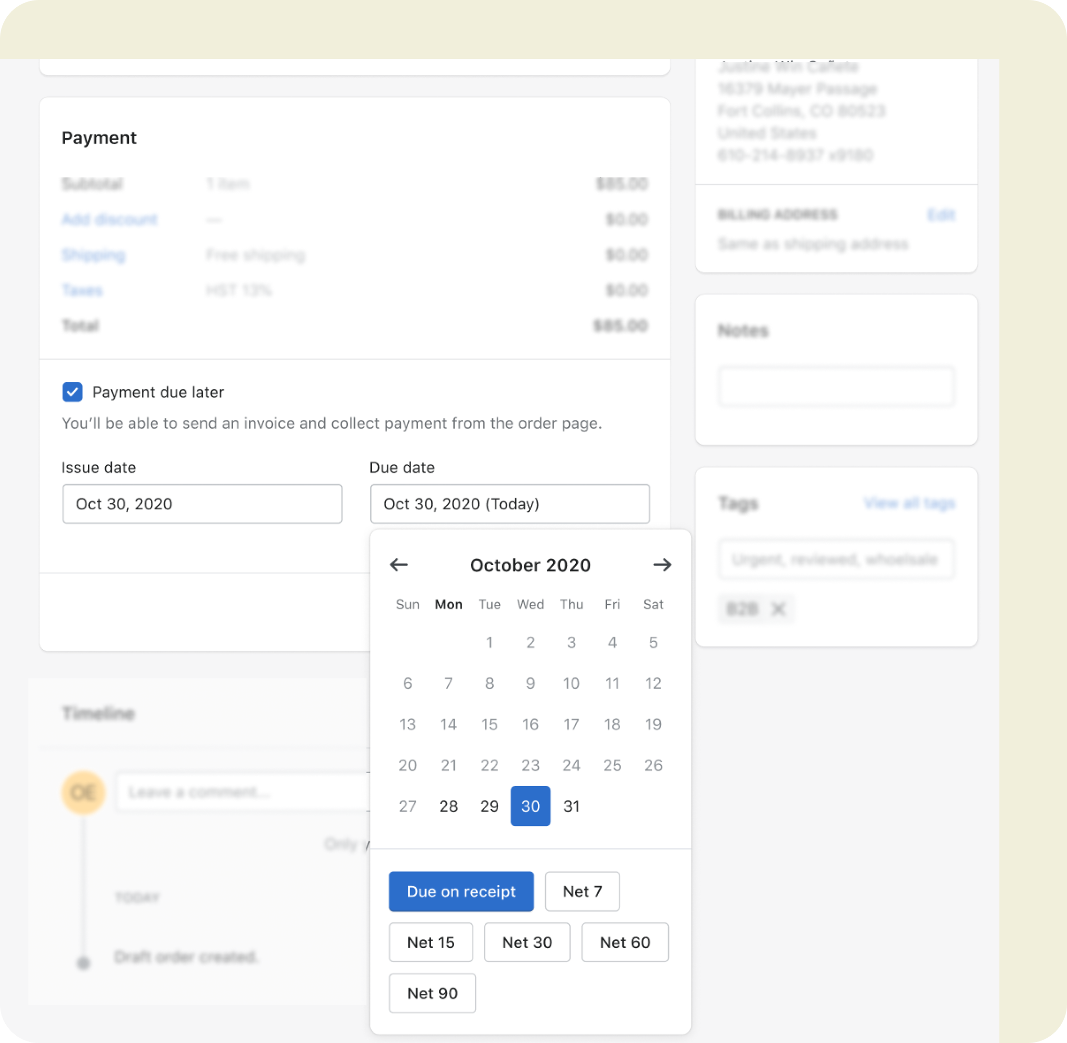
For our first iteration, the merchant builds a draft order and then decides whether they want to collect payment now or later. If they chose later, they can check the box and choose the right payment terms. Once everything looks good, the merchant converts the draft to a finalized order and sends an invoice to trigger the start date which then calculates the due date.
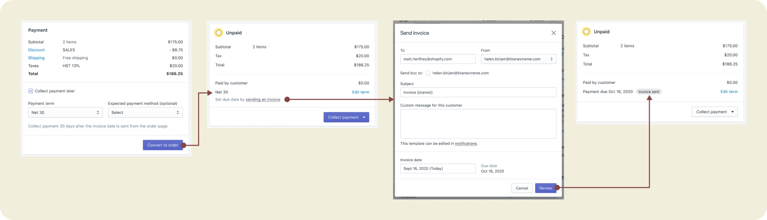
We went with this approach because we consider terms as a piece of payment information, not an action. Also, draft orders can be automatically created by 3P apps so it’s important that the UI works for filled states and is easy to review and change. Because of the assumption that payment terms is strongly tied with invoices aka “request for payment”, we went with the idea that start date is triggered by sending an invoice to the buyer. We knew that this approach is quite risky, which is why we opted to put this forward so we get more interesting insights in our first research session.
Research and iterate
Usability test
Feedback
Merchants clearly understood what each payment action means and figured out how to defer payment.
⌁
While there’s general excitement now that they can set due dates, D2C merchants took a bit of time setting it up because due on receipt and net terms were new concepts to them. We need to explore more inclusive language while finding opportunities to educate merchants on business terms.
⌁
Grouping expected payment method and payment terms made it seem like payment collection is automated. Until it is, we should keep them separated.
⌁
Sending an invoice should be optional and flexible because not everyone uses this method to collect payment.
Explore other ways to set up payment terms
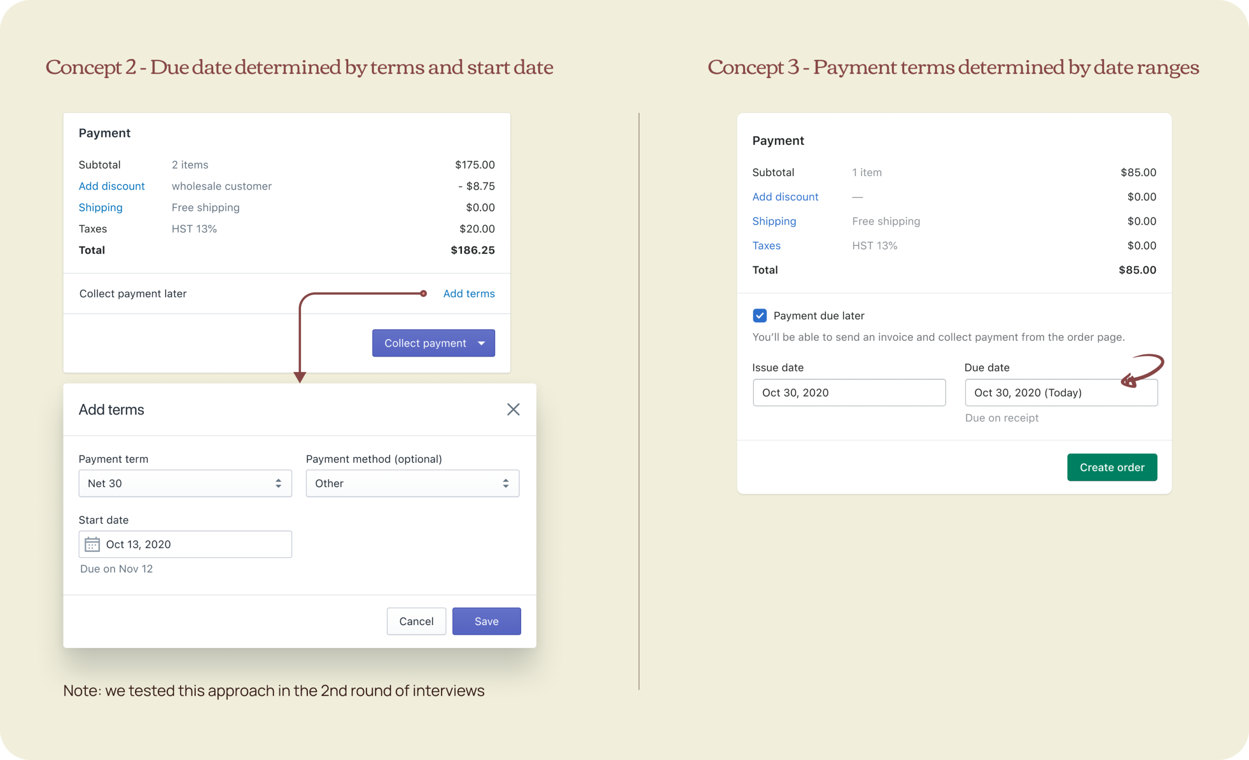
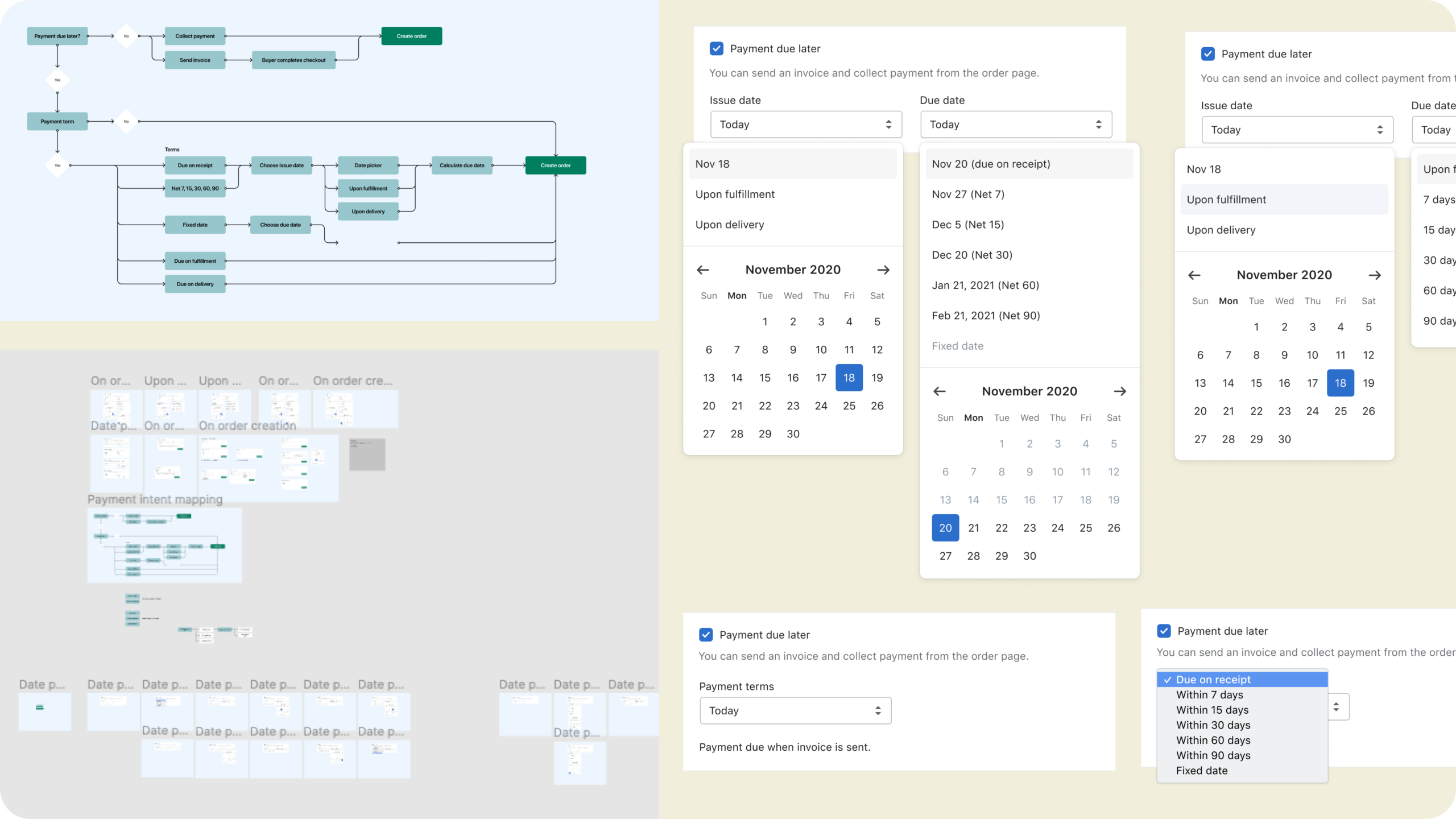
After the first research, I wanted to explore other ways to set up payment terms. What can we use aside from a checkbox, can we use the same hyperlink pattern on drafts and orders, how about letting them choose the start and due date to determine the payment terms?
I was opinionated about using a link for consistency but then learned after a hallway (remote-style) testing with 3 internal D2C merchants that the word “terms” in itself, and the fact that it’s a subtler UI, makes it hardly discoverable. D2C merchants don’t think of terms when deferring payments. It’s clear at this point that terms as a payment attribute and the use of checkbox is the most compelling solution.
Consider scalability with split payments
I also considered scalability for split payments which is something we’ll support down the road. Does our solution scale gracefully for more complex inputs? What happens when there are multiple schedules? Showing the fields in-card only works for minimal input fields. With all these considerations, followed 3 more prototypes, async stakeholders review, and a couple of UX and team reviews.
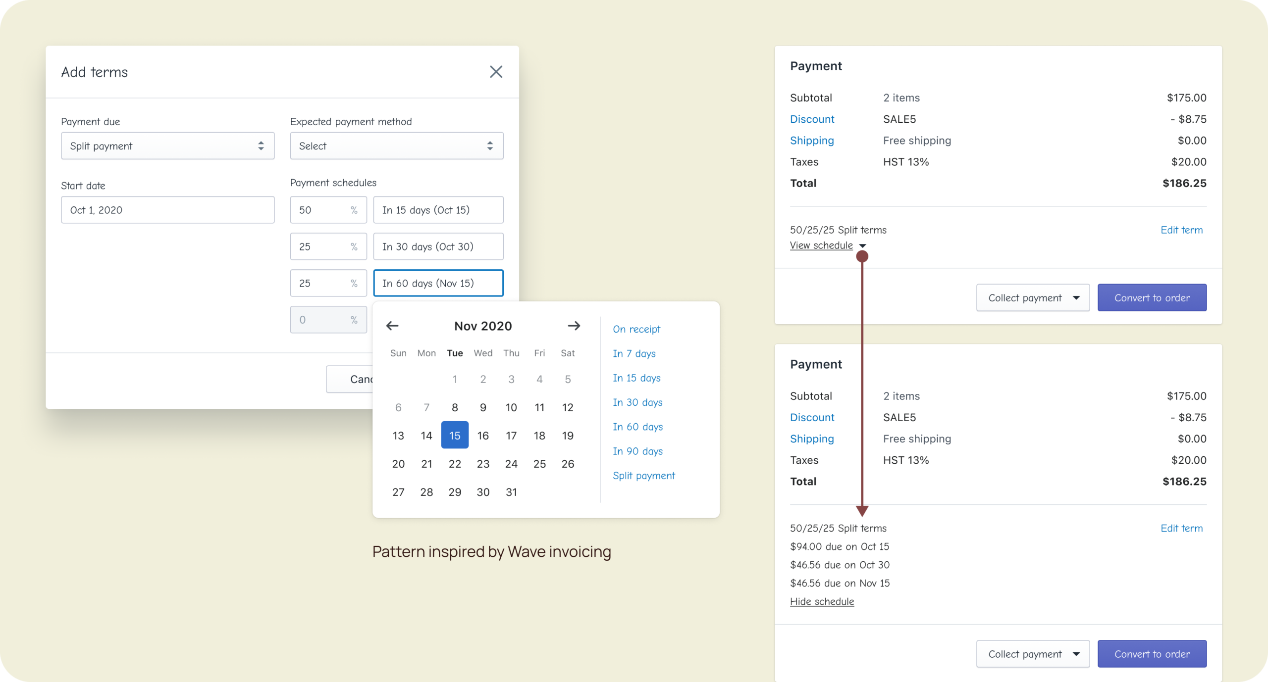
...eventually we went into a "what-if" rabbithole.
UX Crit and Stakeholder's Review
Feedback
We spent so much time exploring the UI for date selection because of split payments and event-based terms. The devs had too many what-ifs. While discussions were really helpful, they made decision-making slower since everyone had an opinion. It was getting complicated, so I knew I have to prototype floating ideas once and for all to show why too much flexibility in the UI is counter-productive. We cannot keep ideating forever.
In the end, it resulted in fruitful conversations with the team. It made everyone realize that we’re overcomplicating the flows, and that split payments and event-based terms will probably not be built in 3-4 years. Even if we do, we might just redesign the entire draft orders page, making past solutions obsolete. We have to design realistically. With the complication also came accessibility and FED implementation issues, especially on mobile. However, it also gave BED a better sense of how API should be structured so it works for complex terms like these.
The other concepts were too complex for the task at hand. There were also concerns about the accessibility and mobile implementation of the popover.
“Testing the prototype interaction made it clear that we’re overdesigning this flow. This changed my mind.” - backend dev
“This will be tricky to implement on mobile since popovers are clunky especially with complex inputs like this.” - frontend dev
“We shouldn’t rely on merchants to calculate the number of days to determine the payment terms.”
⌁
"Payment due later" is more distinguishable and matches the intent of deferring payments better than “Collect payment later".
“[Collect payment later] and [collect payment] are so visually similar that it was hard to differentiate the two at first glance.” - UX Director
Final solution
Pre-purchase: take all the best parts
It’s funny how designers explore so widely and sometimes come back to their earlier and simpler ideas. I guess the purpose of exploring bad ideas is to prove they’re that bad. The final solution was the combination of all our learnings and the best parts of our explorations.
Payment due later
Reflects the merchant intent for deferring payments
Accessibility
Add aria-live to the due date summary to announce any changes
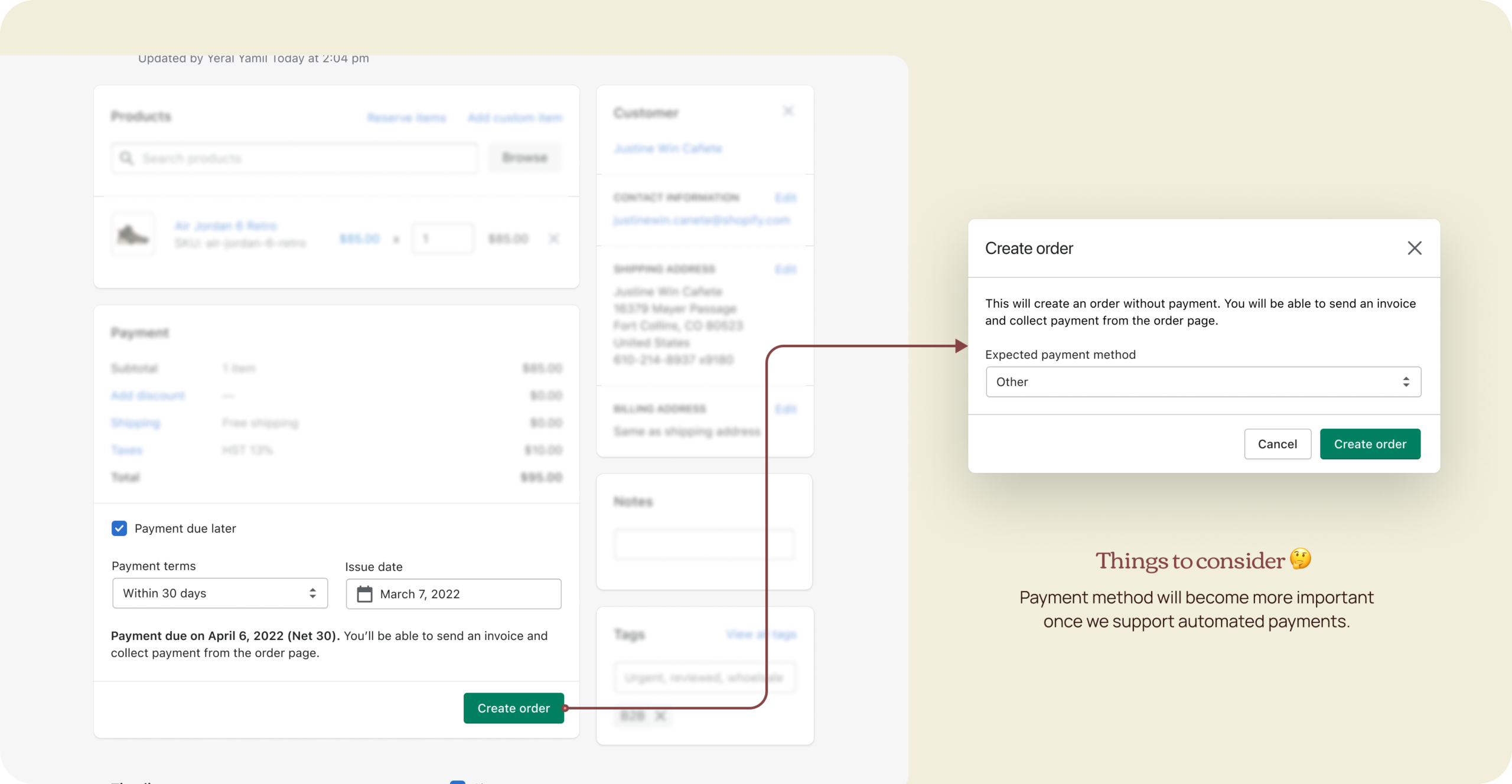
Create order
Call to action describes the end goal
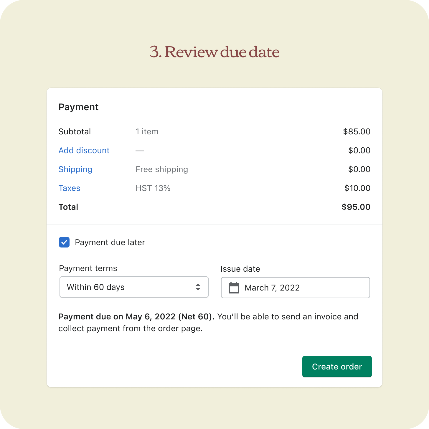
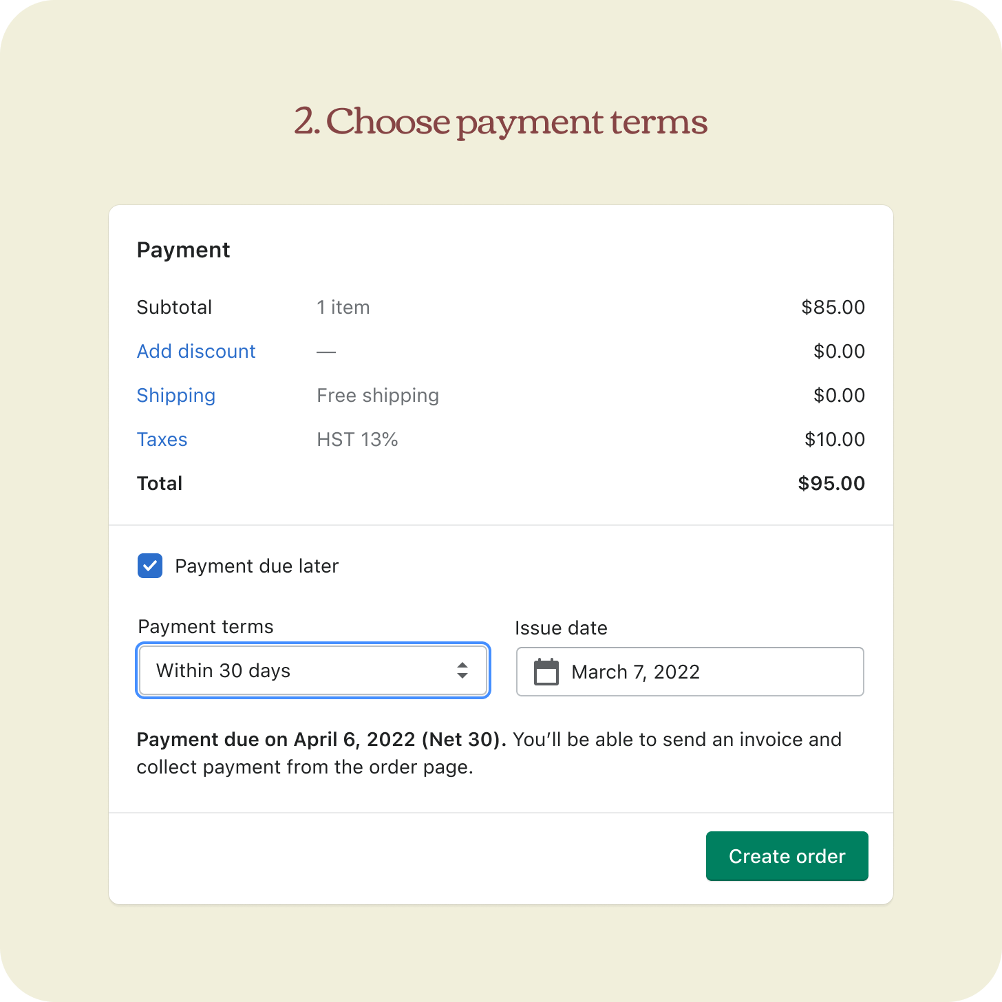
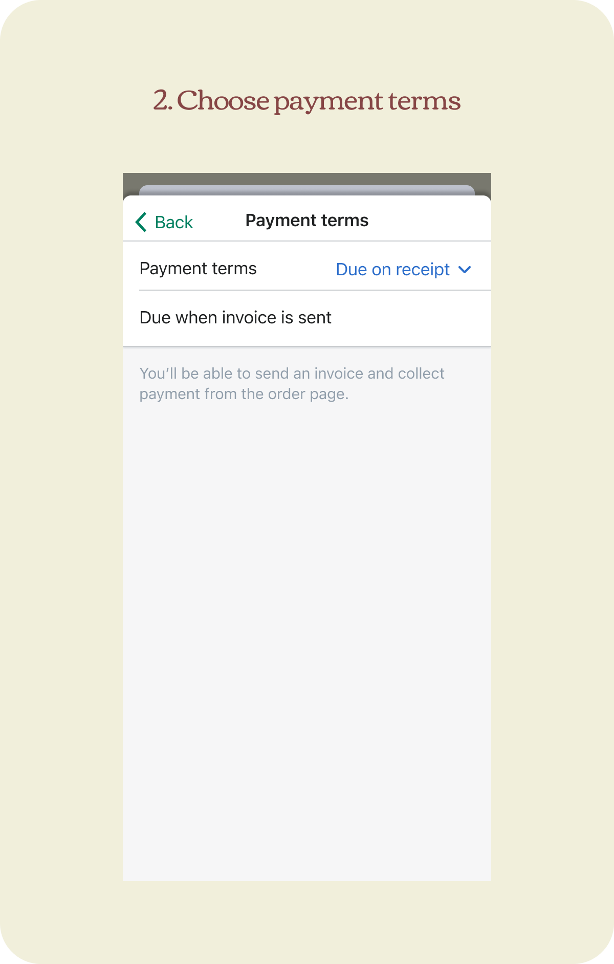
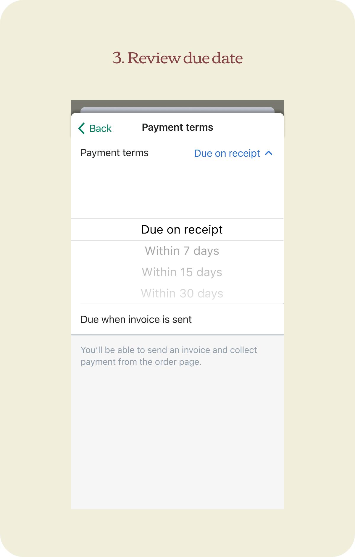
Setting due dates
Term duration + Issue date = Payment due date
Expected payment method
Disassociate from payment terms until we support automated payments
Order lifecycle
Here's an overview of all the term types and how they are displayed in the order life cycle. Once an order is fully paid, the payment terms are completed, removed from the card, and the event is logged in the order timeline.
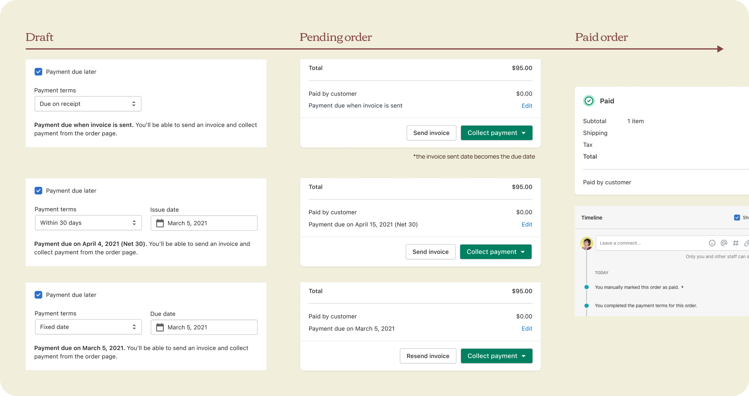
Confirmation modal
I kept the expected payment method field in the confirmation modal, so we don’t confuse merchants that automated payments is not yet supported. This will be more relevant when we start working on payment automation.
Final solution
Post-purchase
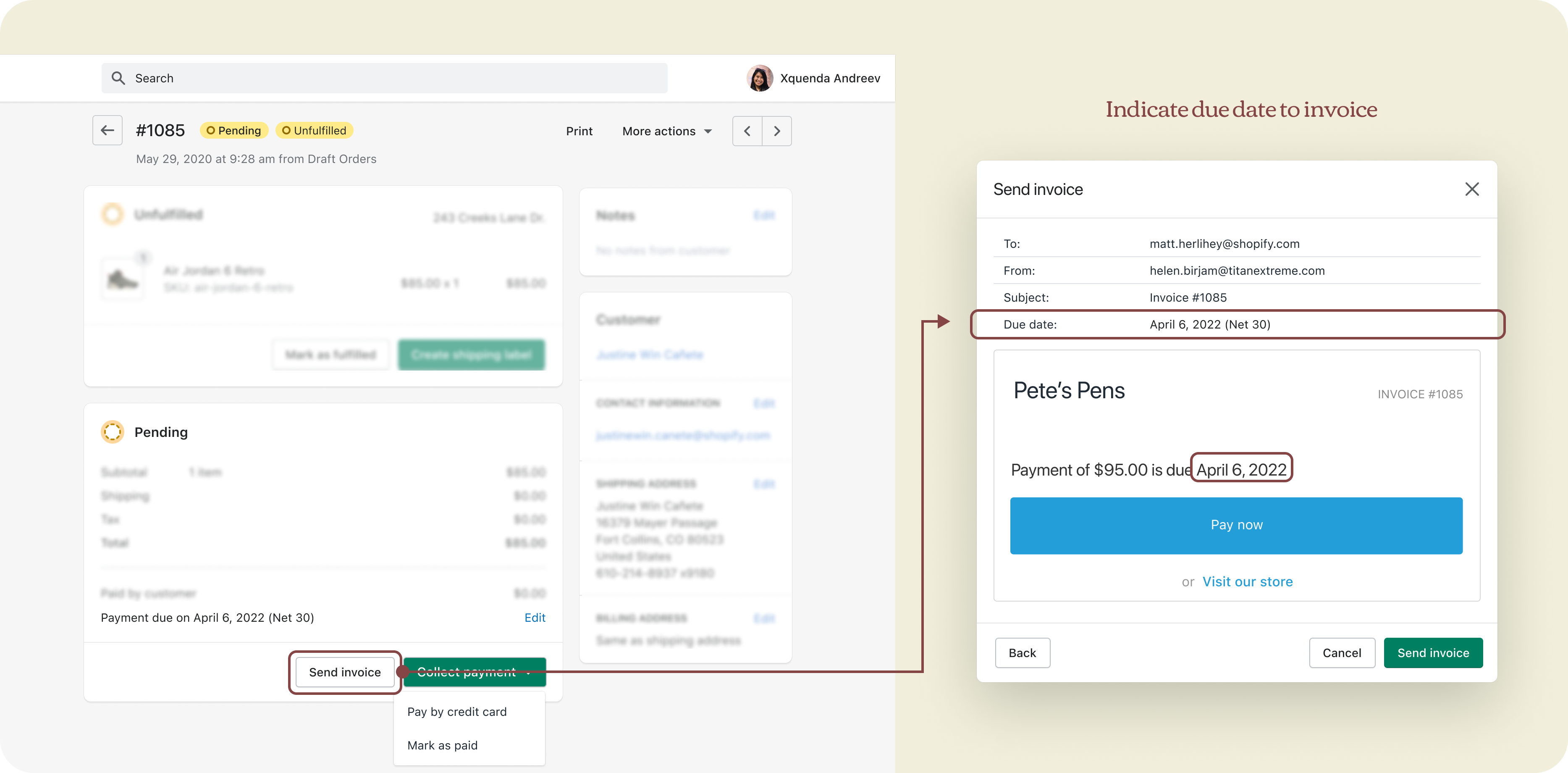
Collecting payment + Invoice
Whenever a piece of new information is added to an existing notification template, we’ll have to create a new variable and ask merchants to manually add it so it appears in the email.
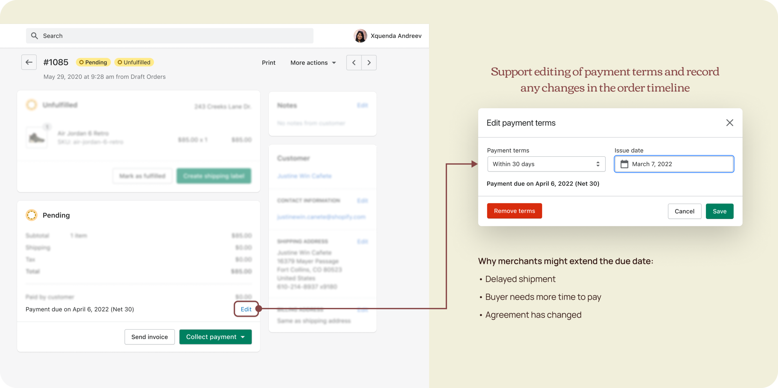
Edit order
Payment due date should always be indicated in the payment card of pending orders, the order edit flow included. He applied content changes from draft and orders to this page for consistency.
Edit payment terms
Meanwhile, I worked on the edit flow which reused the same input fields. Unlike a draft, which is still an “intent to purchase”, an order is considered a “purchase contract” so changes are less likely made and the same is true for terms. In our research, merchants rarely edit the due date and if they do, they usually adjust the issue date, not the terms, since terms are negotiated.
A subtler hyperlink UI is generally used on this page because changes should be more intentional and a little friction is actually desirable. Since the orders page is owned by a different team, I ran UX reviews with them to make sure it aligned with their guidelines.

Payment tracking
For payment tracking, I looked at how apps handle past due payments, worked with a content designer, and even considered completely renaming pending to unpaid. Which would’ve described better orders that need further action from the merchant since pending meant something is already happening in the background. While we have lots of good reasons to reevaluate and overhaul payment statuses, we have to be realistic on timelines and dev effort. This is something we will tackle for automated payments, where clearer statuses is crucial.
We landed on “overdue” which is quite universal and short enough to work in different translations. It’s a piece of additional information to a pending order. Similar to an authorized payment that may or may not be expiring, a pending order may or may not be overdue.
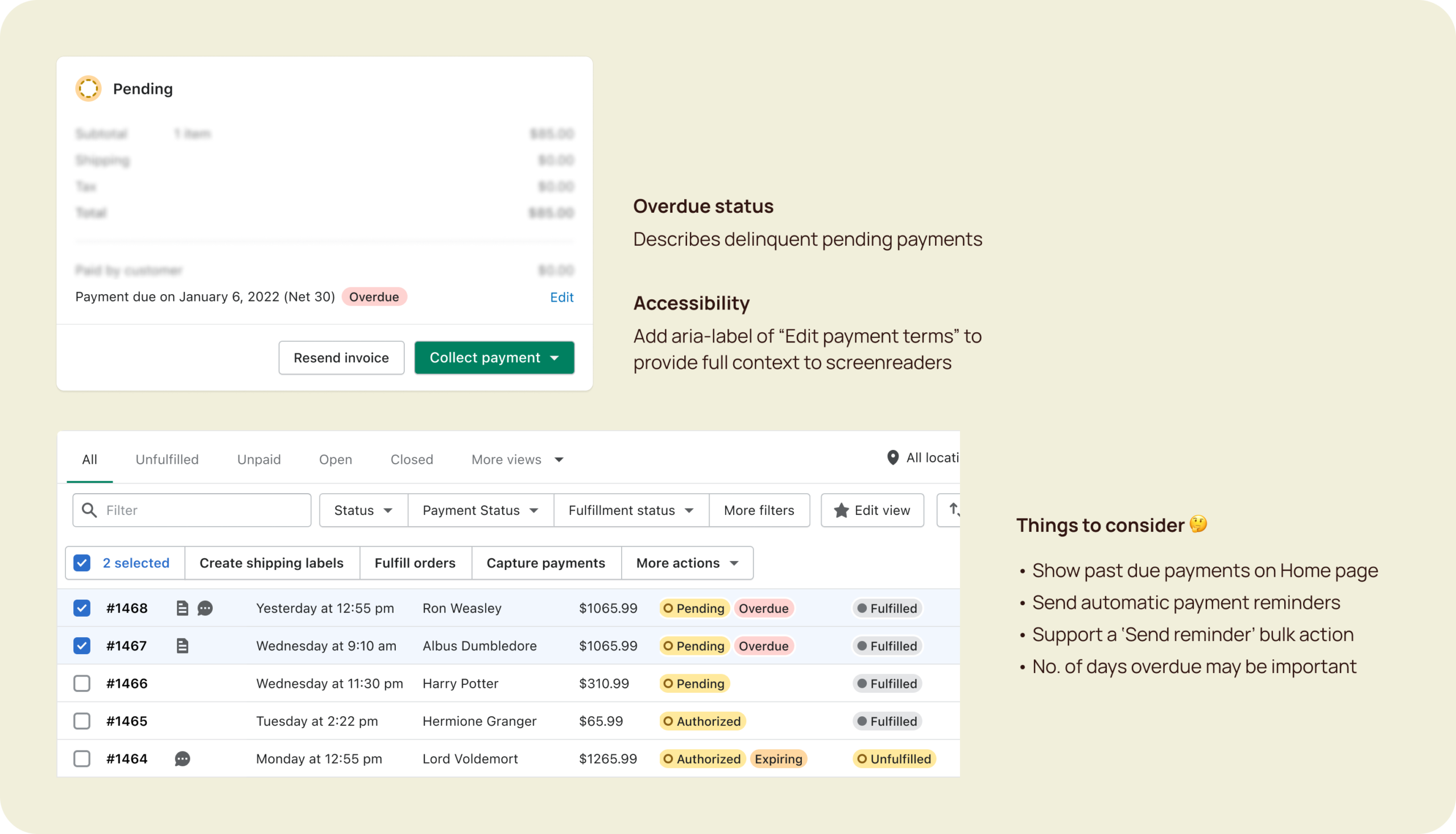
Being able to filter by x days overdue may be desirable down the road but for MVP, it’s better to keep things simple and gradually add more as we learn after the launch. The specificity also brings more dev work and opens up a can of worms especially on the index page— for that to work, we have to recalculate the due date from today’s date and update the badges periodically. It wasn't worth it.
Final solution
Mobile
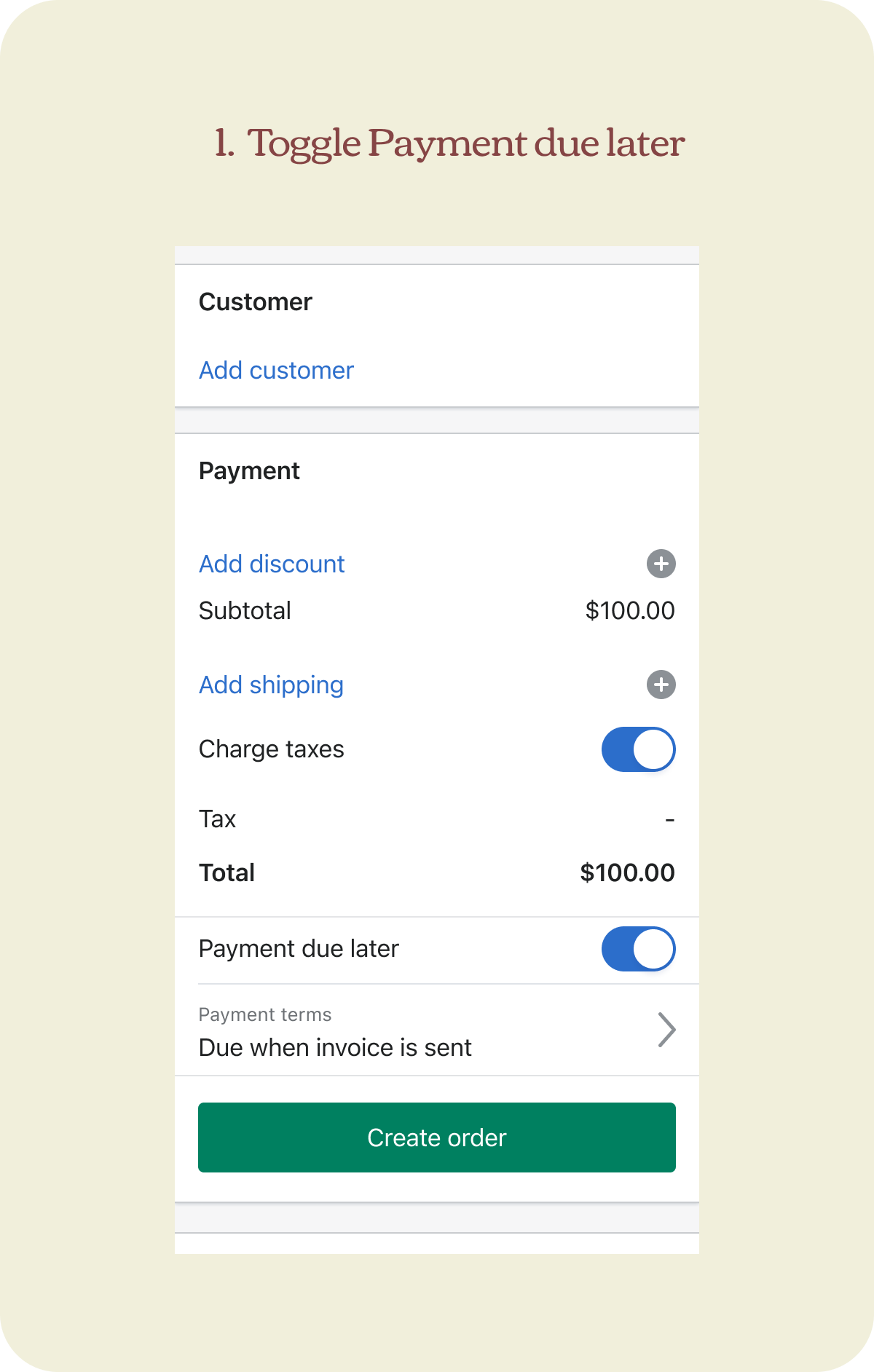
I took on the entire mobile work which is fairly straightforward after we figured out the web experience. A lot of the work here involves familiarity with our mobile patterns and choosing the right components. For example, we don’t have a checkbox on iOS, so a toggle is used instead.
There are good reasons why I opted for a drill-in experience instead of showing all fields in-card:
- Users are used to drilling in on mobile, and it’s a pattern commonly used in our mobile app.
- The majority of merchants accessing drafts order via mobile are D2C, who will also due on receipt for most of their use cases, so defaulting to this is actually efficient.
- Having a dedicated space allows for better consumption of information, especially on smaller screens.
Ship and support
Design handoff, UX decision log, care package
One of my proudest moments in the project was documenting the UX decisions, leading the design handoff for both mobile and web, writing the care package for our launch, and pairing with writers to update our help docs and write the marketing announcement. All of these meant that I amassed the context and knowledge that my team entrusted me to do these things.
✶ Business impact
The feature was launched to all shops in August 2021:
- +30% in deferred payments GMV every month
- +20% in active users using payment terms every month
- Strong desire for more term types that we recently added Net 45.
Last updated April 2022
✤ Learnings
- Payment terms being my first project in the new team sped up my onboarding process and allowed me to understand the nuances between a draft and an actual order.
- Exploring widely helps with scalability and future-proofing but a good designer knows when to stop and reflect on realistic timelines.
- Lean on competitive analysis and secondary research for familiarity and ease of onboarding.