Notifications settings v2
Marketing email preference
A better marketing email preferences that adhere to legal and security requirements
✤
2023 ✶ Gusto ✶ Lead designer ✶ Web
Role
Design lead
Other contributors
Content designer
UX timeline
Mar - May 2023 (3 mos)
Platform
Web
Role
Design lead
Other contributors
Content designer
UX timeline
Mar - May 2023 (3 mos)
Platform
Web
Problem
After a few months of rolling out Notifications settings, we were asked to migrate our marketing comms from Marketo to Iterable to cut down costs. Our priority was to continue giving our users control over the marketing emails they receive, while finding opportunities to improve the experience.
Gusto
As part of cutting down yearly cost, we’re moving Members from using Marketo to Iterable. It's also an opportunity to improve the marketing email preferences experience for all users while addressing legal and security concerns.
Users
Provide clarity on marketing emails users opt in and out of.
Proposal
Revamp the marketing email preferences experience and introduce a new category standardization for all our marketing emails.
Understand
The current experience
I met with the marketing team to understand how this page works, how it's set up using the old tool, and get context on the type of emails users receive. And boy oh boy was I in for a ride.
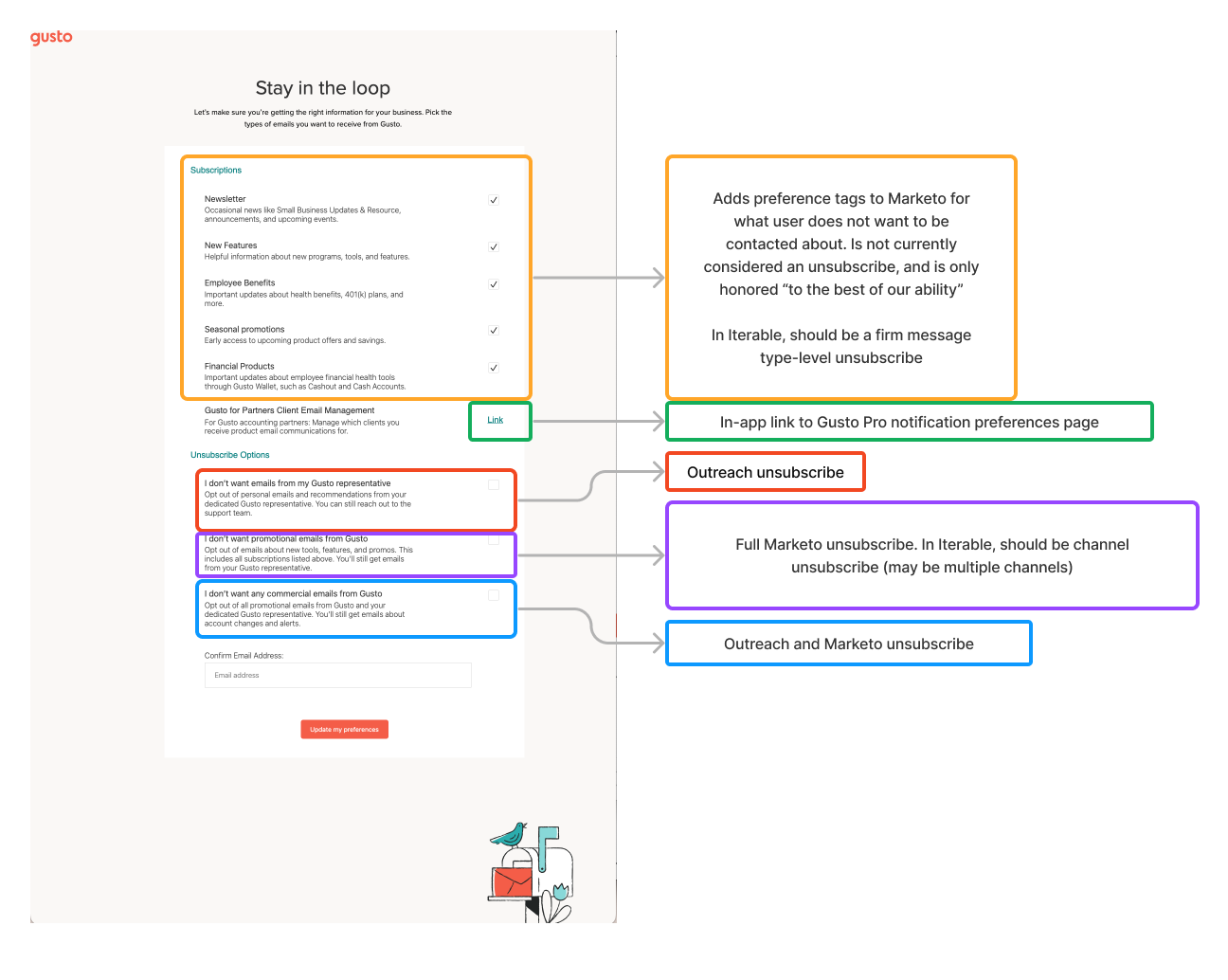
Old marketing email preferences experience and how they're mapped out. We previously linked users to a separate page.
The information architecture is baffling, and compliance poses serious issues. Teams use diverse email tools like Salesforce and Marketo, yet lack unified categorization. Manual tagging, non-verification of email fields, and our failure to sync user preferences lead to potential misuse and security risks. To address this, my goal extends beyond UX fixes; it involves convincing teams to embrace new category standardization. Our developers engaged with integration partners to ensure bidirectional synchronization with Salesforce.
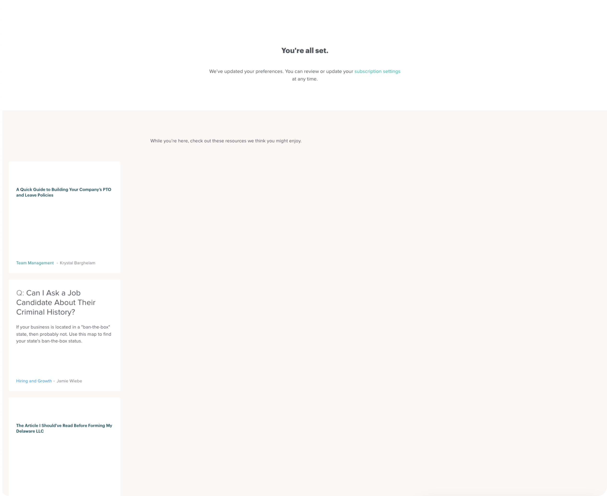
Confirmation page, that doesn't actually save the user's preference
Design process
Research
My design principle when building common experiences like email settings is to not reinvent the wheel. We all receive marketing emails on a regular basis, so there’s already some level of expectation on what this experience should look like.
Scalability was top of mind so I started researching universal categories which cover both our existing and future use cases, like research and surveys. I observed that some companies, mostly social, allow users to type their email, while those in fintech are much stricter, forcing users to authenticate before they manage their settings. Gusto aligns more with the latter, and after talking to our legal team, this is also the approach they advise taking to meet compliance.
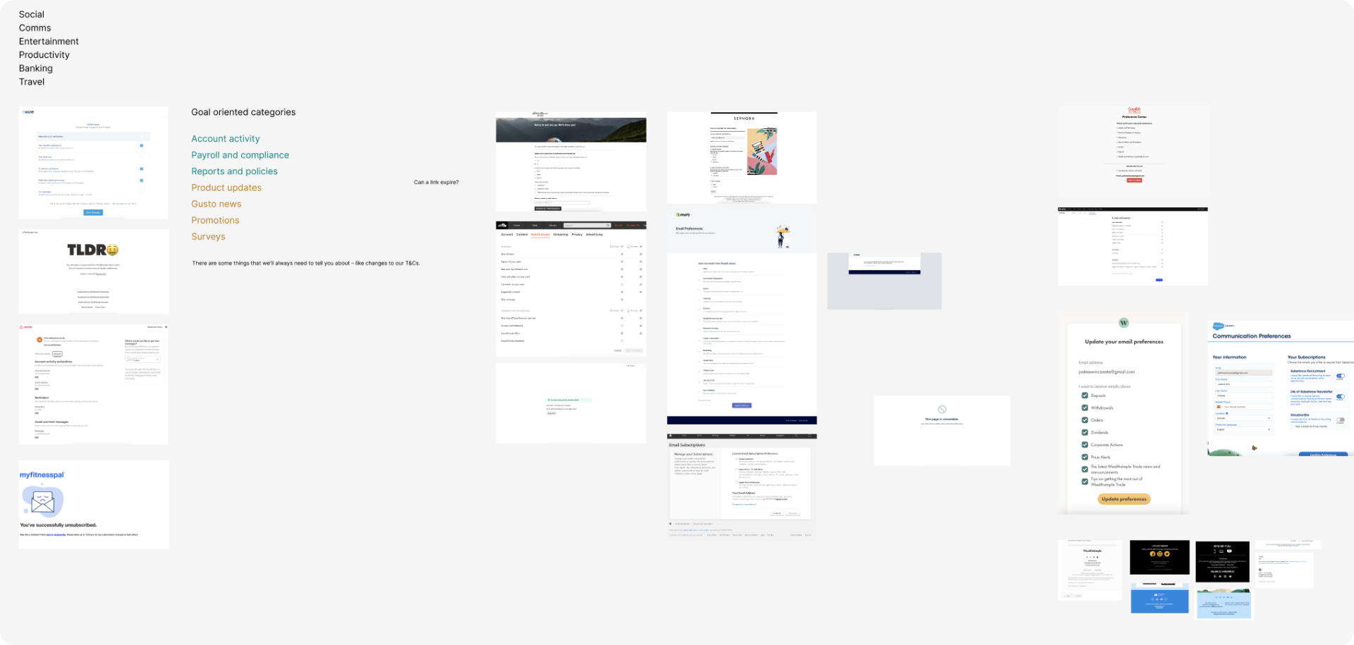
Screenshots of marketing email preferences out in the wild
Categories
Categories are the biggest piece of the solution so my first iteration was focused on pairing with our content designer and aligning it with teams using different emailing tools to promote unification and ensure that all the emails they send can be mapped out to the right category.
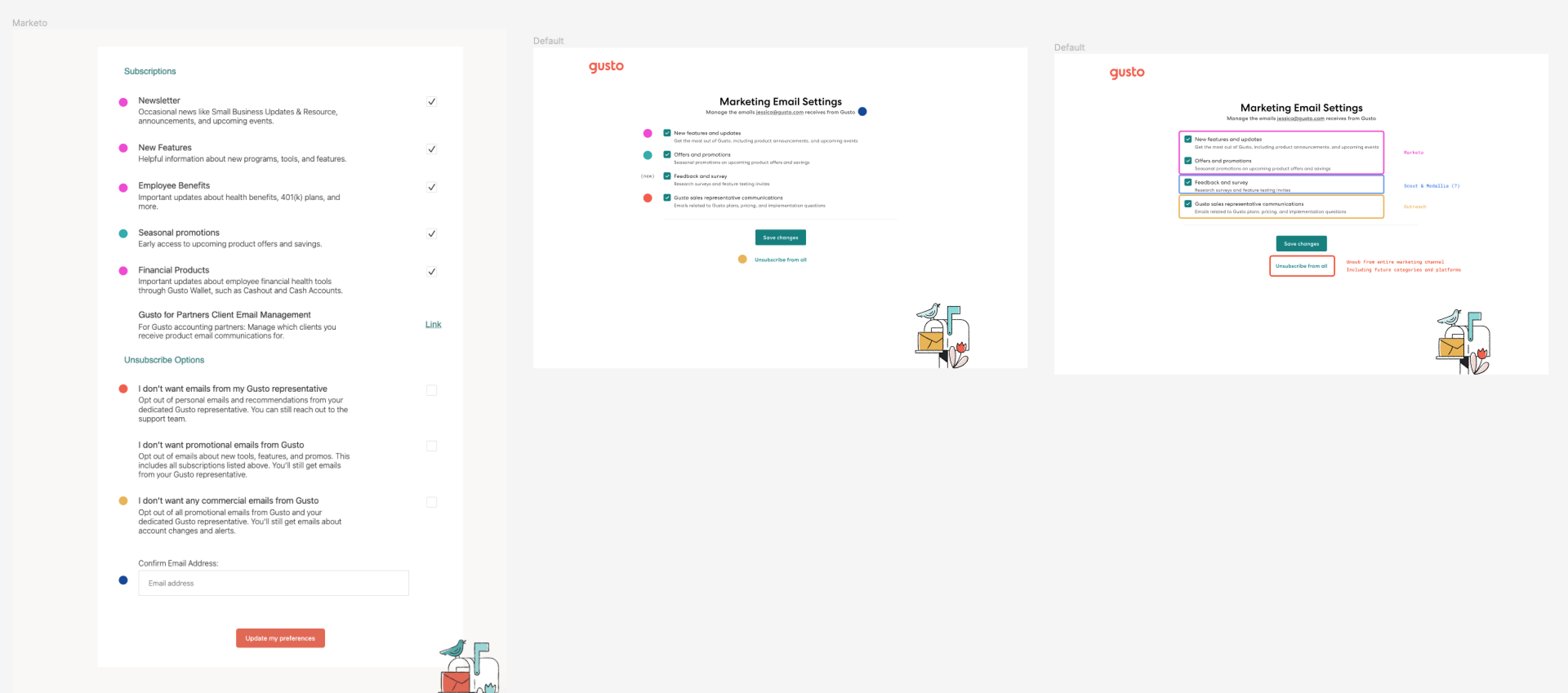
My proposal on how we will migrate and unify existing categories to the proposed new ones (color-coded)
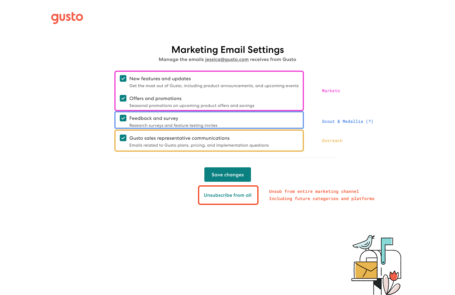
New standardized marketing categories that covers all existing and future use cases
After a series of syncs and alignment meetings with our stakeholders and partners, everything else was straightforward. The only consideration I had was the in-app experience, where we can either have a single form or have each section be its own form submit. The latter is how we sync the backend, but it doesn’t have to be reflected 1:1 with the experience
Final solution
Logged out experience
The first use case is for prospective customers who don't have a Gusto account yet and have opted in either through our blog or a sales agent. They still should be able to manage their emails by clicking a link from the email footer. This improvement simplified the categories and cut the number in half, moreover providing concise and clear descriptions of what each category includes.
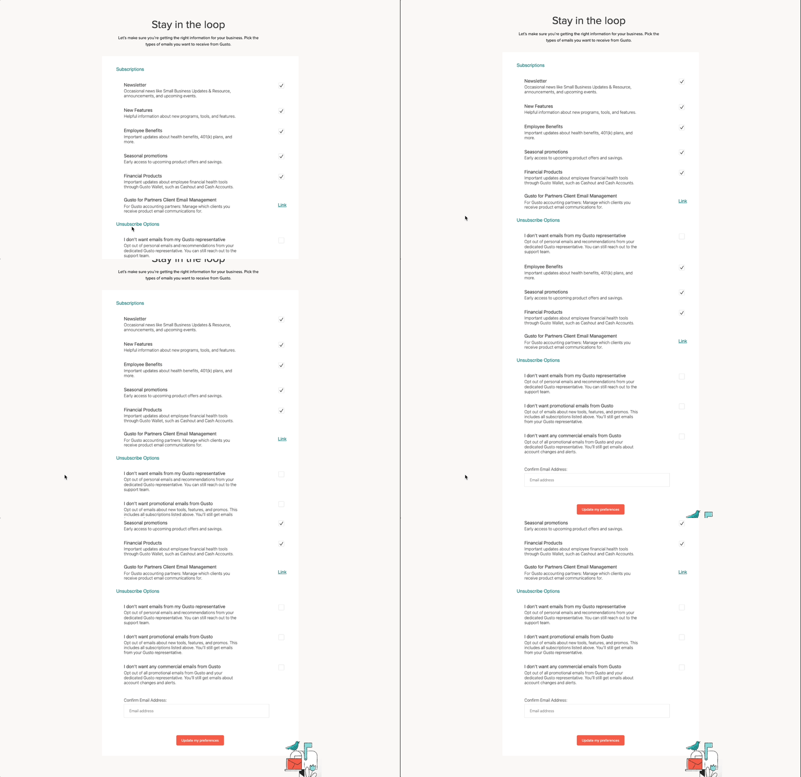
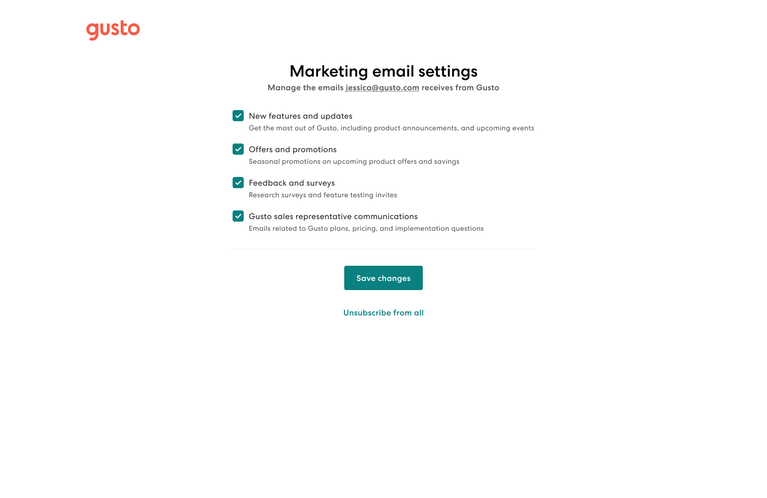
Before and after
There are a couple of notable improvements:
- Addressed security concerns by removing the email input and replacing it with the user's email address pulled from the email footer.
- We're now able to save and remember the user's preference and sync it back to Salesforce.
- Respect the user's preference by mapping each email to the new standardized categories (no more manual tagging).
- Improve the unsubscribe landing page and introduce a resubscribe experience.
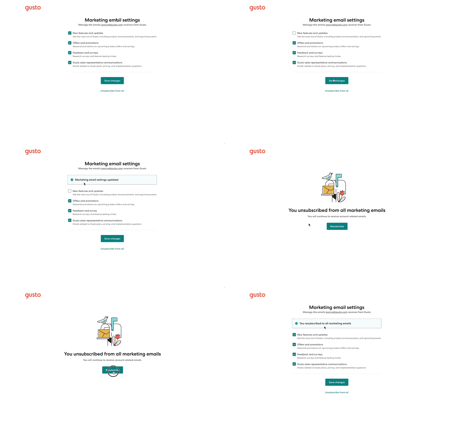
End to end experience of marketing preferences page
In-app experience
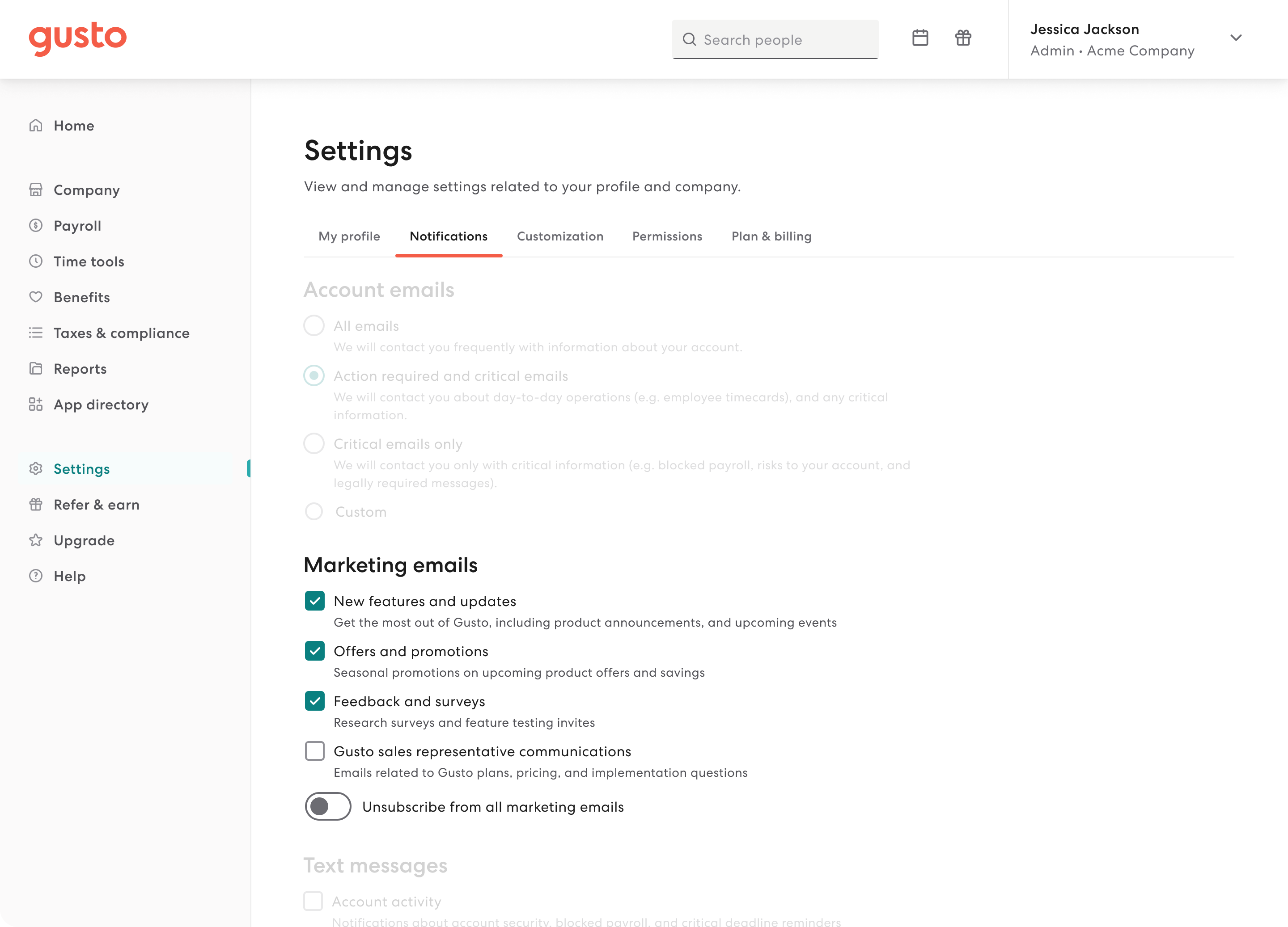
The second and more common use case is for users with a Gusto account. Upon clicking the link in their email footer, we authenticate and link them to the Notifications settings page where their marketing preferences are displayed:
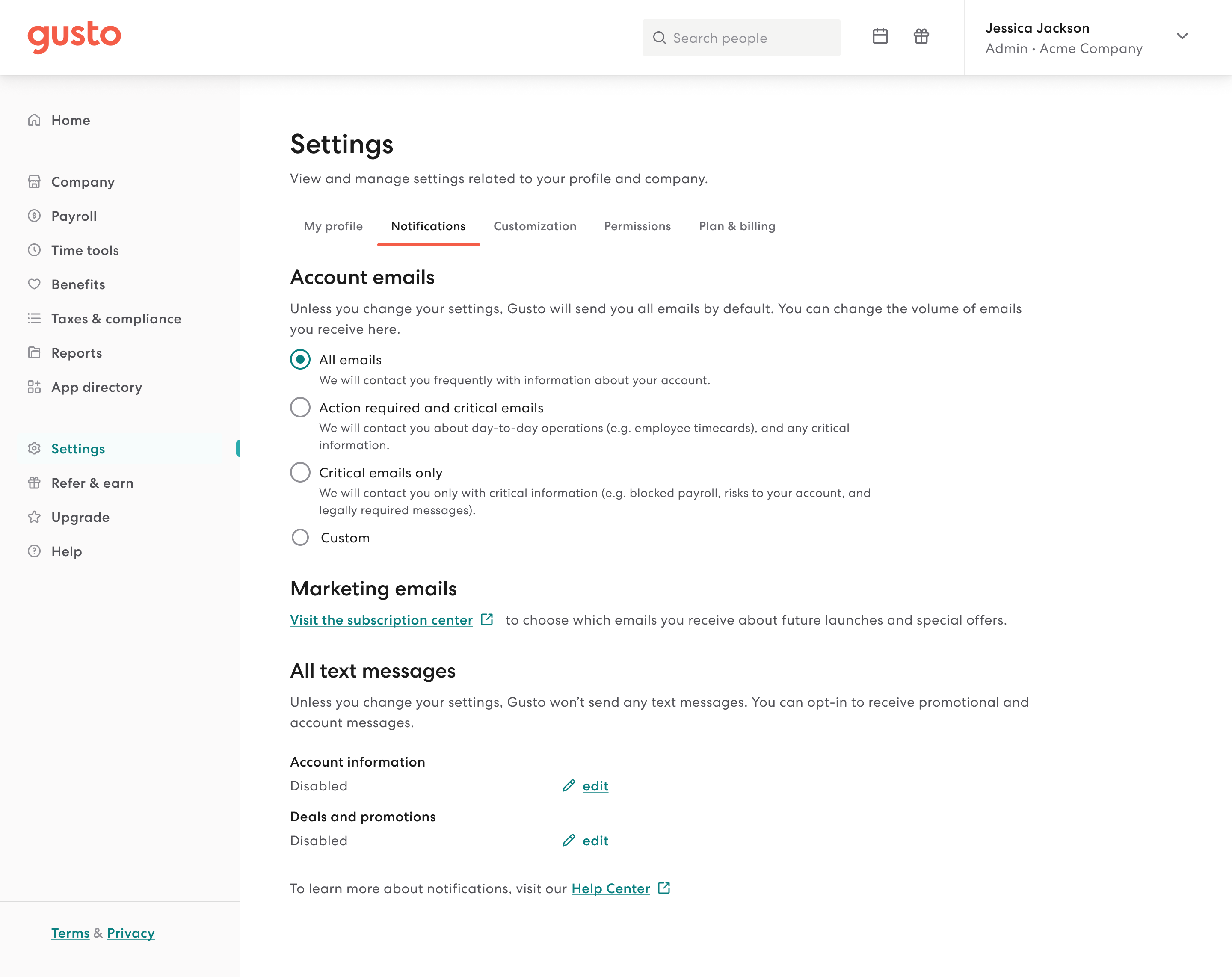
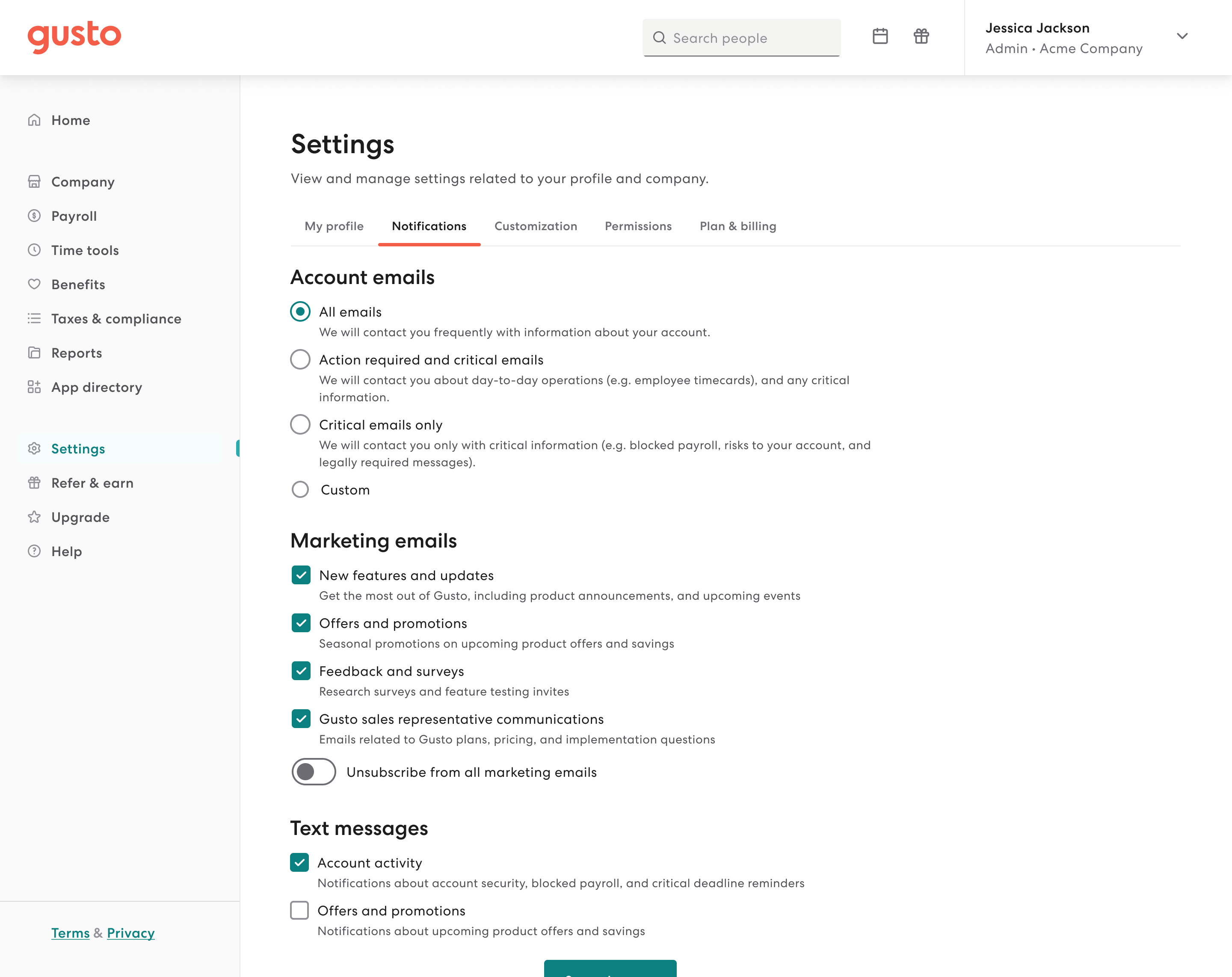
Before and after
There are a couple of notable improvements:
- Users can now manage their marketing emails all in one place, instead of having to go to a separate external page.
- Notifications can now be managed more quickly by having them in a single submit form, instead of each section being tucked in a modal which can feel unnecessarily inefficient.
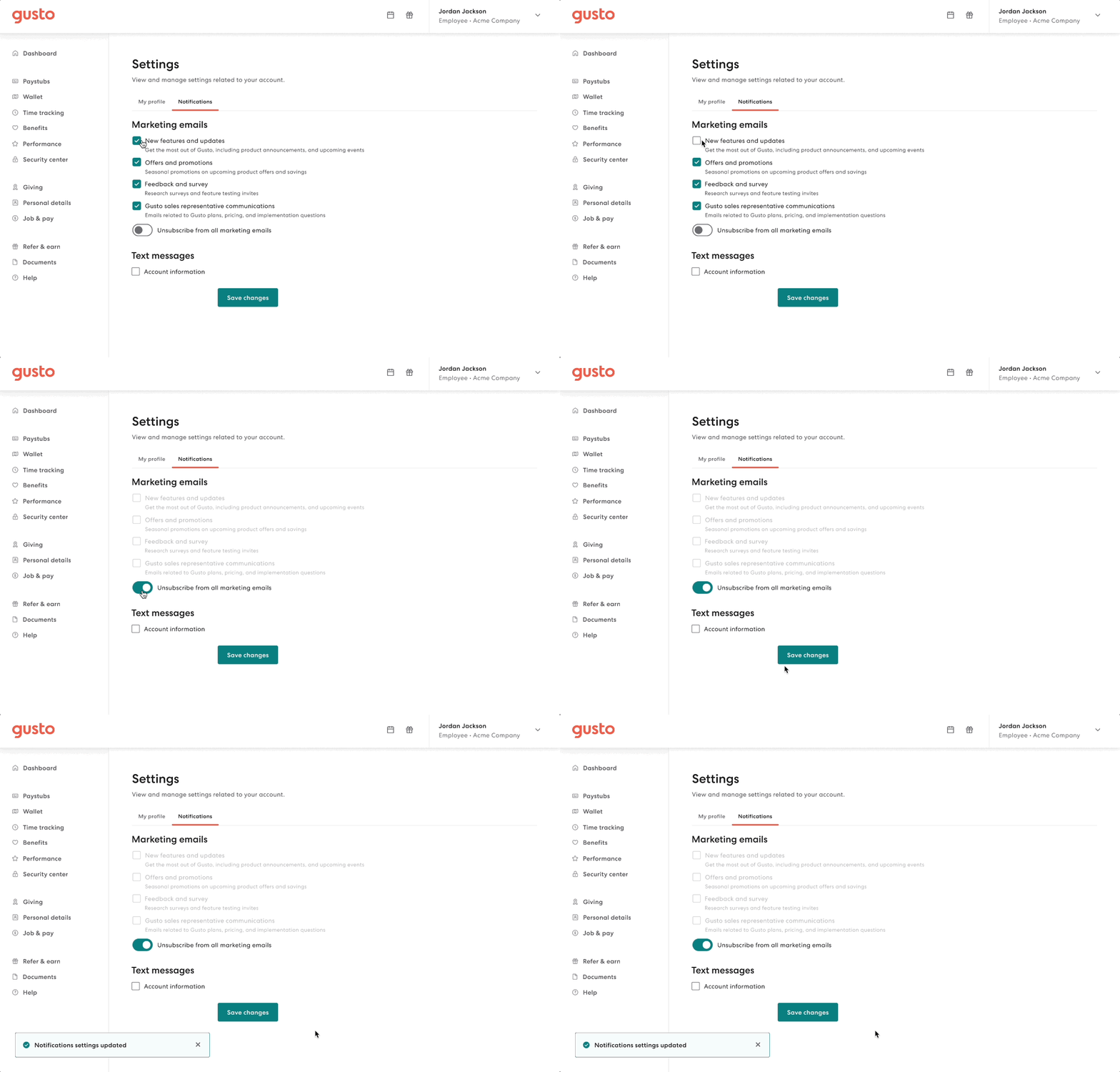
End to end experience in-app experience for Members
Text messages
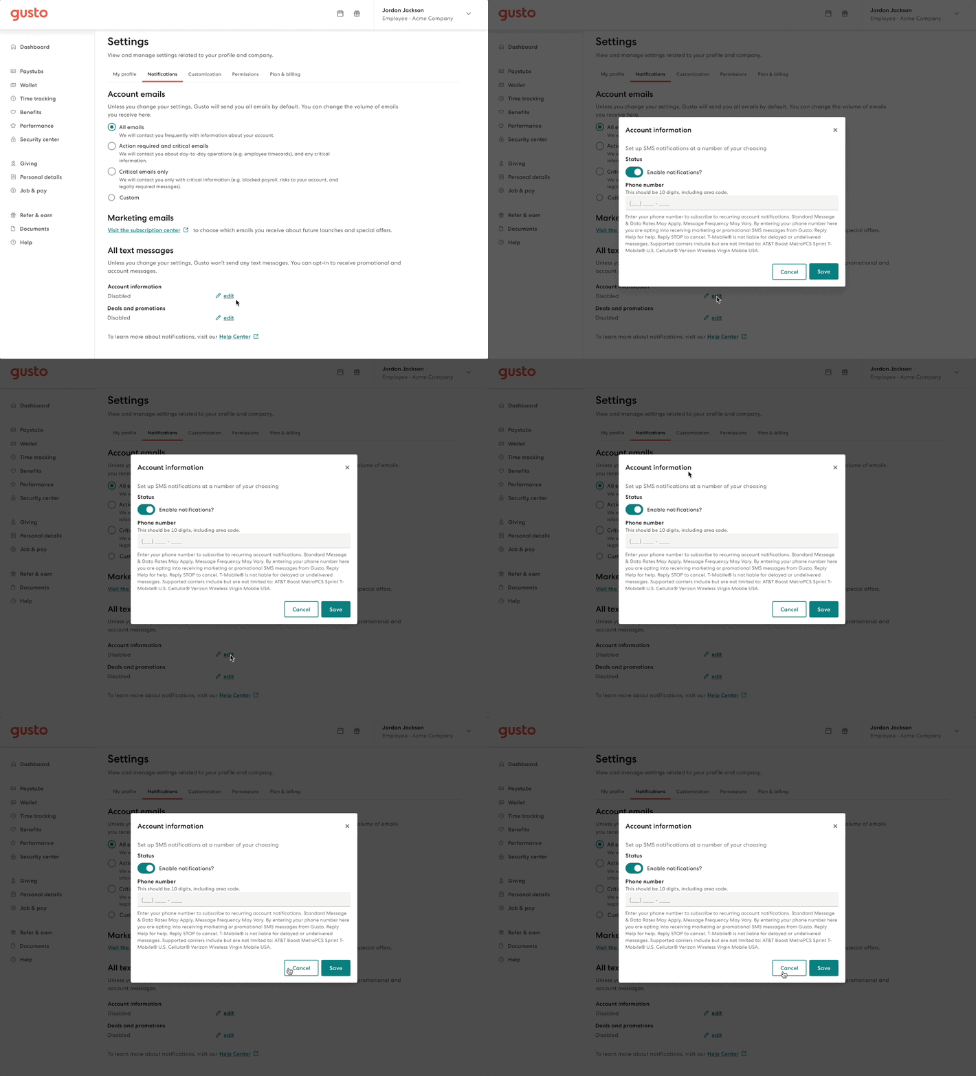
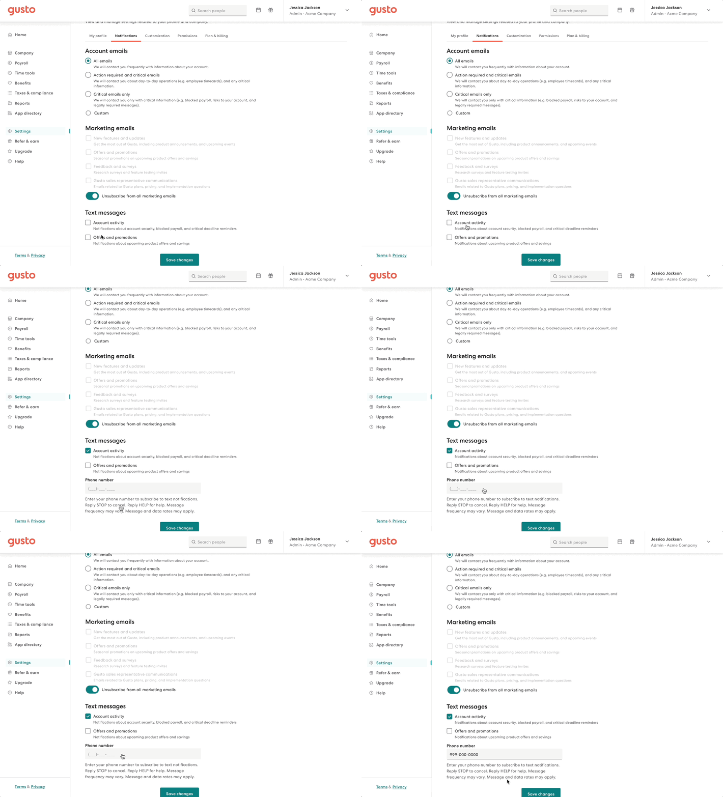
I also pushed the team to include text message improvements as part of this work. This work prompted us to investigate the different phone number collection points and ensure that we're storing them properly. I also reached out to the Platform team on whether we want to continue allowing customers to use different phone numbers for each text message category— and aligned that this is not a use case we want to support. And so, I simplified the experience further by using the same phone number for all categories and pulled them from the modal and into the page. After consulting with our legal team, I was also able to update the legal fine print to be more concise and approachable.
Bringing it all together
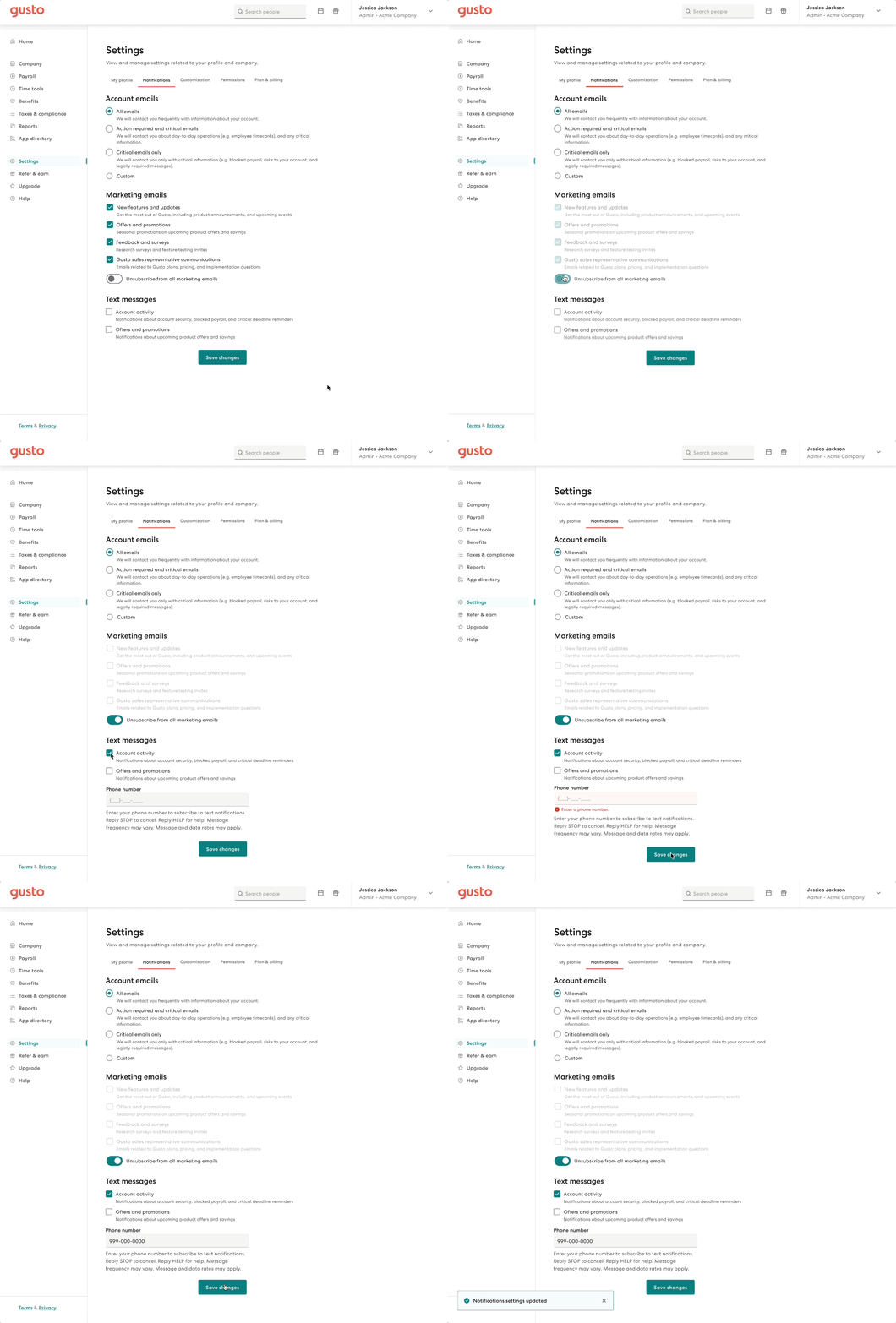
An (even) better notifications settings
Overall, I was able to materialize my ideal experience for Notification settings — simple, clear, and efficient.
Ship and support
Dev handoff
The UX work concluded with a dev handoff, and ongoing support involved providing feedback to our developers during the build and addressing any emerging edge cases.

✶ Impact
- Users are more discerning than anticipated in choosing which communications to receive. When given the choice, 62% of users opted out of promotional emails, while 38% opted into some or all promotional emails.
- This work put us one step closer to goal-oriented categories. In one of my conversations with my PM, we began talking about channel-agnostic comms, where the user starts with their goal and intent, then the system automatically determines which channel it makes sense to send out those comms. I shared that vision work with our team which empowered our devs building the new Notifications API.
Last updated Nov 2023
✶
Thanks for reading
✶
✶
The end
Meow you doin'?
Let's keep in touch.
Ottawa, Canada
Email: justinewincanete@gmail.com
© Justine Win 2025
Product designer